Monday, December 13, 2021

Devastation in the Mid-South

Tornadoes wreaked havoc across the U.S. Mid-South on Friday night into Saturday, as an energetic shortwave trough tapped into the abundant moisture and atmospheric instability in the southern U.S. One supercell, persisting for at least 11 hours, spawned a very long tornado (probable path length > 200 miles), generating some of the night's worst damage in Mayfield, Kentucky. Meteorologist Jack Sillin documented the forecast of the supercell's evolution and some preliminary facts (Figure 1). With over 100 tornado deaths, the day was the deadliest since 2011. 

Figure 1: Depiction of NWS forecast evolution of the Quad-State Supercell, by Jack Sillin.

ProbSevere guidance is used by NWS forecasters to aid in warning decision making. A new version of ProbSevere (version 3) is being developed and tested at the University of Wisconsin, honing and improving the probabilistic guidance. For the quad-state supercell, ProbSevere v3 (PSv3) was generally 10-20% higher than PSv2 in the hours before it became severe (Figure 2). For instance, PSv3 was 68% at 22:28 UTC, compared to 46% for PSv2. The top predictors contributing to the higher probability were:

  1. 1-3 km mean wind (48 kts)
  2. 3-6 km MRMS AzShear (0.011 /s)
  3. 0-2 km MRMS AzShear (0.012 /s)
  4. Effective bulk shear (65 kts)
  5. Effective SigTor Parameter (1.73)
  6. Normalized satellite growth rate (2.8%/min; "moderate")
Tornado probabilities were higher for v2 than v3, which we've found to often be the case (i.e., ProbTor v3 is more conservative). However, the trends in both PTv3 and PTv2 matched the trending threat of the supercell well. Users can inspect the storm's trends in probabilities and predictors here

Figure 2: Time series of ProbSevere v2 and ProbSevere v3 for the quad-state supercell. Note that severe reports are preliminary. 

Figure 3: ProbSevere v3 contours with MRMS MergedReflectivity at 03:30 UTC and NWS severe active weather warnings, when the tornadic quad-state supercell was in Mayfield, KY. 


Tuesday, June 22, 2021

Mesoanalysis Summary for E. CO

Looking at a surface map there looks to be a boundary, possibly a weak warm front, over E CO that storms are firing off of.  A similar feature can also be seen in the satellite data taken at the same time.


Lightning:

The FED did not give as much information about the growth stage of the updrafts as the flash minimum area did.  Also noticed the VII trend resembled a similar trend as the flash minimum area did.

The flash minimum area is also a good way to help catch the eye of what updrafts are strengthening, especially if the trend of low flash minimums persists.  Great tool to use at first glance of which storms need to be watched and which don’t.

-Dwight Schrute and Accas

Saw several examples of the flash density for lightning either muting out or not showing the trend the flash minimum area was showing.  In the past I have been using the flash minimum area to help me see trends in the lightning, but am now seeing that I should be using the flash minimum area instead if I want to see trends in lightning activity.  I use the lightning trends to help me know if the storm is rapidly intensifying or suddenly weakening and possibly about to generate a severe downdraft.  Being able to see these sorts of trends better can also help communicate a potential threat for storm intensification or severe wind development to those in the path of the storm.

-Accas

Area of coverage greater for the  minimum flash vs extent density.

Next time stamp, we can see increased minimum flash area lightning over the new updraft and a pixel from the flash extent density. So the minimum flash area would likely be the best bet for using the tool with decision support services in mind due to its higher sensitivity.

-Dwight Schrute

This was a scenario where we were baffled by how little lightning was being shown from both the minimum flash area and flash extent density products. We asked why so little lightning compared to how much ice is in the storm, combined with MESH indicating a 2” hail stone.  The lightning with this maturing storm was not being sampled well.

-Dwight Schrute

Gridded NUCAPS Issue WI/MN


Sampling Total PW gridded NUCAPS with contours overlaid on top, we see that the values are unrealistically high (over 3 inches). The 18 UTC soundings from the Twin Cities offices shows PWATs only around 1.30” which confirms this is incorrect. Also, the contours are in centimeters, not inches which is what the images. I plotted the NUCAPS sounding points to see if the points were “yellow” but it looks like the points were unavailable at this time step.

From this time step, the gridded NUCAPS matched up very well with the special 18 UTC soundings and the total PW values are realistic and make sense given the environment. Also the NUCAP points are all green which solidifies that the satellite was able to obtain a good sample.

– Fear the Shear

NUCAPS in the ARX Area


Comparison of a modified 18z NUCAPS sounding in far southern MN suggested a fairly accurate temperature profile (surface temperatures in southern MN were warmer than up at MSP.). NUCAPS did miss a pronounced dry layer around 700 mb, while it was too dry higher up especially around 500mb.

We also noticed some erroneous gridded NUCAPS precipitable water data round 16z across the Midwest (values of 3 to 4 inches). These looked more reasonable with the pass at 18z.

There was also 120 to 150% 850mb and 925mb RH.

The only satellite pass around that time was Metop-A. While the soundings were yellow, they generally were ok and didn’t match the gridded data.

– Barry Allen

ProbSevere On Some Early Storms Near ARX

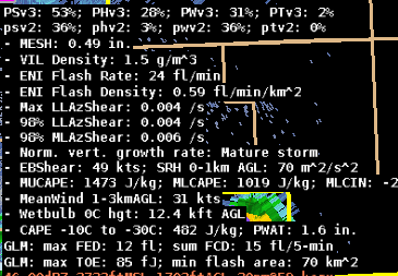
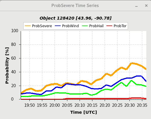
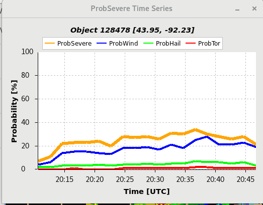
 We noticed a relatively high ProbSeverev3 (53%) on a rather innocuous looking storm (MESH around 0.5”) around 2030z. This was higher than the v2 value of 36%. The individual probs were relatively evenly weighted at lower values near 30%.

(clockwise from top left) MRMS 18dbz echo top, MESH, reflectivity and ProbSevere (storm in center), and low-level MRMS azimuthal shear.

(clockwise from top left) GLM FED, GLM MFA, reflectivity and ProbSevere (storm in center-right), and GLM TOE.

GLM FED was unimpressive, though it’s unclear how much of this is related to lower detection efficiencies in this area. ENI total lightning was halfway decent. High DCAPE values and other environmental parameters may have been sending the ProbSevere v3 higher.

Timeseries for the storm of interest.

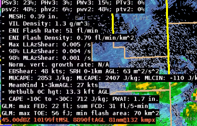
Another storm further to the west over SE MN had slightly lower MESH (.39”) but in this case PSv2 was higher at 48% vs Psv3 at 23%.

– Barry Allen

ProbSevere Time Series

 I found the ProbSevere time series helpful today as we “triaged” storms and tried to identify storms that may become severe. While the capping inversion stayed strong and therefore prevented storms from becoming severe, it was great to see storms follow a similar intensification process identified by the Prob time series time graph. Most storms intensified in a similar fashion but capped out when ProbSevere reached ~40%. After 40% storms would remained steady state and then gradually weaken. Noticing these trends and seeing them plotted visually helped us pick up on the trends. Any storm that deviated from this and grew upscale faster would be easy to identify on the ProbSevere time series graphs. We knew what the “norm” was for storms in this capped environment because of the time series graphs. We surmised that once the cap broke (which would be after the experiment ended), we could quickly ascertain when storm would finally be able to grow upscale by looking at their respective time series.

– Fear the Shear

Progressive Disclosure and GLM Flash Points

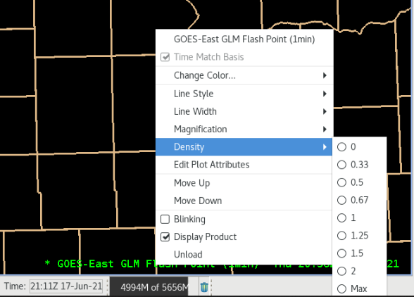
 When loading GLM Flash Points, there is no preset density of the data.

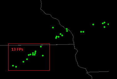
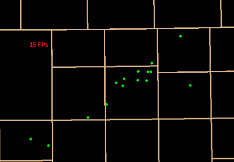
This does affect how much flash point data is displayed depending on the zoom level of the map. In the 2 maps below, within the red square of the larger map, 13 flash points are indicated as opposed to 15 once you have zoomed in further:

Unless the forecaster knew to increase density to max, this could obscure some important clusters of lightning coincident with storm evolution.

– Guillermo

GLM Flash Points

 Noted GLM flash points really help speed up the process of identifying where the cell of interest was located.  In the past, I would have to make a manual, on the fly “calculation” in my head where the actual cell was located.  If there was only one cell, that was easy by looking at radar.  When you get into the complex thunderstorm situations, that can be difficult and in the worse cases, it is too involved.  Seeing how the flash points seems to fix and/or surround the updraft, really helps speed this process up and give confidence to the forecaster which cell is the cell to be worried about.  This could also help with warning confidence.  The  image below shows an prominent example of this.

It is hard to see the flash points but there are 6 points surrounding the core of this small storm.  I chose this one to verify the positioning as it was on its own so it was easy to figure out which one it came from.  As such, seeing how close this is to the core, it makes it much easier to identify which FED “spike” is from which core.  

When looking at satellites with flash points, it also help confirm the location of the core as the ABI imagery is parallax corrected.

– Strato-Dragon

GLM Lightning Preset 4-Panels

 GLM lightning data provides very useful information to the operational forecaster, especially when properly combined with radar/satellite imagery. Would it be possible to take best practices suggestions from frequent users to lead to the creation of some pre-set 4-panel procedures that could be found in the AWIPS GLM data section (similar to what is available with radar base date, etc.)?

Sample 4-panel image pulled from the GLM Quicklook Guide

– Guillermo

Derived Motion Winds in AWIPS vs Rabin Optical Winds

 Had attempted to compare the AWIPS Derived Motion Winds to Bob’s Optical Winds: https://www.ssec.wisc.edu/~rabin/winds/goes16/b13/1/m1/iris/layers_loop.html but encountered eventual CAVE crashes each time. While, on occasion, being able to display and toggle different layers of DMW in AWIPS before crashing, I did find that the Optical winds had much higher resolution wind data than what was available in AWIPS (with max density) and wind directions, by layer, seemed to well agree.

It is my opinion, though, that, while the DMW winds in AWIPS could be useful, they seem resource-intensive and come with a significant likelihood of freezing or crashing the CAVE instance. I find it much quicker and more reliable to view the similar data via Bob’s webpage.

– Guillermo