Showing posts with label GLM. Show all posts

Monday, May 19, 2025

4-Panel GREMLIN Satellite

 We discussed how we would handle warning this cluster of storms around 20:30Z Mon 19-May-2025, whether we would do one big SVR warning encompassing the whole cluster or concentrate into individual storms with different hail sizes and/or wind speeds. If I was warning this and saw a similar presentation in the radar for both clusters, I would begin with a larger SVR encompassing both storms.

The satellite product I use most often for cloud top cooling/warming for diagnosing convection growth is the Ch 13 IR. By using Ch 13 IR satellite and GLM Flash Extent Density, that helped me determine which updraft was the strongest and/or tallest. The overshooting top visible in the bottom left corner with the northern storm cluster suggests a quickly growing updraft that may start to produce large hail (and/or damaging winds) soon given the lapse rates and the explosive environment. Corroborating this with GLM FED and discussing with the group, we also came to the conclusion that the southern cluster of storms is probably broader but not as strong given its broader but less concentrated lightning presence, and might even be weakening below severe limits. With this information, I would have probably SVSed my warning to only include the rapidly growing northern cluster and maybe upping the hail size.

GREMLIN also tends to agree that they start off with relatively similar intensities, but eventually the northern storms take precedence. Using all four of these products together from the start to finish of the storms’ lifecycle would inform my warning decisions for initial issuance, SVSing, and eventual EXPing or reissuing downstream.

4 Panel loop below.

Loop of GREMLIN (top right), Composite Reflectivity (top right), Ch 13 IR (bottom left), GLM FED (bottom right)

- millibar

Monday, June 3, 2024

High Confidence in Progressive/Weak MCS

KSHV radar trends illustrate a cold-pool dominated, weak MCS approaching the NW corner of the CWA. Many satellite products illustrated a consistent mainly sub-severe weather episode unfolding giving increasing confidence in the near-term forecast and expected impacts. Focus would be on any stronger individual updrafts for potential isolated severe thunderstorm warnings. 

Overall, there was high confidence in approaching thunderstorms per radar and LightningCast data pinpointed the ongoing widespread nature of the convection, given several embedded impulses of GLM spikes behind the leading southeastward surging outflow boundary:


East Octane SpeedDirCTD-CTD_4Pan procedure provides more calculated parameters on top of RGB and ABI products to quickly diagnose convective strength/intensity.

The top 3 panels below (OCTANE speed, direction and Cloud-top Cooling and Divergence) identify a large-scale cirrus canopy with embedded updraft impulses.

Situational awareness was enhanced by adding on local KSHV and KLZK radar which helped to identify a SSW to NNE boundary and associated CI ahead of the main line, which OCTANE products began to illustrate (see center of each product, identifying increasing speed/directional divergence colocated to the convection along the boundary)

Given the environmental parameters, this would have been a location to examine for the potential of a severe thunderstorm warning, especially if associated radar trends (RIJ via radial velocity) indicate increasing downdraft wind potential.

- RED11248

Tuesday, May 21, 2024

Warning vs DSS - "WFO DMX"

It was interesting when comparing the Warning side of the house today versus the DSS side. When we (Cumulus and Kadic) were discussing this and picked two of the tools we used the most, there were similarities and differences:

For Warning Ops: OCTANE and LightningCast

OCTANE proved very useful in interrogating convection. LightningCast was also a helpful diagnostic tool in highlighting the potential for and track of intense convection when used with ProbSevere.

OCTANE:

Here's a look at 2 particular instances from OCTANE:

A combination of cloud top cooling in OCTANE and subsequent divergence aloft was a helpful clue in assessing the potential of a storm that was distant from the radar. It was caught a little later in analysis, but OCTANE proved helpful in diagnosing the storm and deciding to pull the trigger.

This next instance was a warning that was issued solely using OCTANE and seeing how well it lined up with radar. The warning targeted the center of where the maximum storm top divergence was taking place, and then stretched down towards the south to account for parallax. The warning decision was made for the impressive cloud top cooling and pronounced divergence that appeared in the scans leading up to the warning. The panel on the top left shows the OCTANE speed, and it transitioned to a blue color leading up to the event.

LightningCast and Radar:

As the line shifted east into the area, ProbSevere stood out, while the LightningCast steadily increased. The left hand panel depicts GREMLIN, and it properly highlights the southernmost storm as being the most intense. Unfortunately, not every storm that we issued warnings for got a specific screenshot, but when looking at LightningCast, areas that were likely to experience 10 or more flashes with a 70% probability seemed to correspond well with ProbSevere values would support issuing warnings.

Below is the example of what MRMS looked like the moment DMXSVR005 was issued solely based on OCTANE. Much of the SVR encompassed the highest LightningCast values with a probability of 10 flashes of 70% in yellow and the various ProbSevere contours. Again, this highlights how useful these tools can be in performing storm interrogation. However, when thunderstorms are numerous, this may be a lot to run through. They are definitely useful tools in the tool belt, though.


For DSS: LightingCast (especially the Dashboard) and GREMLIN/GLM. 

    - LightingCast: I REALLY like the form and Dashboard. It helps focus on the DSS site specifically and organizes the data really well to where I would feel comfortable explaining/showing an EM the graph of   lightning probabilities. Honestly, I could bring this back to my home WFO right now and use this for DSS events this summer. A couple things that could be added to make it even more awesome: adding more options for ranges (right now there is only 10 miles, perhaps adding 15 and/or 20 miles). Folks could then choose which to display in the graph. The other thing (fairly minor), perhaps reversing the size of the bubbles for the GLM data (smaller range, smaller bubble). But, this is personal preference - maybe if this could be customized by the user like the colors?

    - GREMLIN/GLM: GREMLIN followed the storms a lot better today (seems to do better with more intense storms versus run of the mill/sub-severe ones). I used a two panel display with GREMLIN on the left and MRMS on the right with GLM and LightningCast and compared the two. I used time of arrival for the storms to 10 miles outside the DSS event and also at the site itself. GREMLIN was able to keep up with MRMS really well! I am becoming more and more convinced that this could be a really great product to help if a radar goes down or there is a radar hole (in data). 


Overall, it seems as though OCTANE was used more for warning ops versus DSS, but LightningCast was used by both the warning operator and DSS forecaster.


Forecasters Cumulus and Kadic

GLM Trends In A Warning Decision


Severe thunderstorm and tornado warnings were issued partially driven by the increasing intensity of GLM FED. With the indication of a strengthening updraft due to increasing lightning activity atop the convergence signature on radar, a warning decision was made for both damaging winds and a tornado threat. 

OCTANE cloud top divergence also highlights the strongest thunderstorms in our CWA below.


-Joaq

Thursday, May 16, 2024

Making Four Panels into one with GLM Data Quality

 When we started the testbed the GLM products were being displayed on a a four panel display (GIF. 1). This display works fine to find areas of poor data quality, like where the white and yellow pixels pop up in the top left of image 1. However, in it's four panel setup, I felt that the display took up too much space. As a group, we worked to merge them into a single panel.

Image 1: GLM data quality suite, with Data Quality in the upper left, Background image i nthe upper right, Day cloud phase in the bottom left overlaid with GLM flash density, and the Ch.2 Red visible in the bottom left. Please note that the background image has an erroneous color curve on this display; it is usally closer to the red visible in brightness.

Below are examples of single panel displays created. In general, folks preferred the display in GIF two, but I thought there were ways for ways to merge the two designs. My desire would be to have the GLM background image provide texture to the data quality product like in GIF three, but to have the data quality product maintain the sharp good/bad color curve shown in GIF two. Even more preferred is a color bar like in GIF four, where the "could be poor" but not nearly or fully saturated values are highlighted in another color (red in this example).

GIF 2: A single panel version of the GLM suite of products. The GLM background image is the background and unchanged. The GLM Flash Density is overlayed unchanged next. The GLM data quality product Is overlayed on top and has been altered such that the nearly saturated and totally sutured bins show up as pink pixels. 

GIF 3:  A single panel version of the GLM suite of products. The GLM data quality product is plotted unchanged. Overlayed and the reason for the blue-ish hue is the GLM Background Image which has been made transparent in the black. 

GIF 4: The same as Gif 2, except that the poor-ish data quality from 10 to 40 percent is highlighted in red.

What did you think was the best single panel layout?


I also want to share something about the data quality scale (Img. 1). In its current format, the scale is not intuitive. Good data quality ranges from roughly 50% to 90% on this scale (blues and greens). Poor data quality is from 50% to 10. Then, the poorest data quality is white and yellow, and represents nearly and full saturation. I was ready this wrongly, such that 50% to 90% was poor because it was closest to the nearly and fully saturated parts of the scale. Instead, it is reversed. Before this product goes to operations, I would want to see the color bar made more intuitive.

 Image 1: GLM Data Quality, focusing on the scale in the upper left. Poor data goes from 10%, at worst, up to 90%, then nearly and fully saturated after 90% in the center-right of the scale.


-Kilometers

Tuesday, May 14, 2024

Missing data


Charmander and Kilometers were watching over an event in central Tennessee and employed the lightning cast meteogram. The probability of lightning tool worked (img. 1) great for alerting the event staff to an increase in the lightning threat, providing about 45 minutes of lead time. 

I began to monitor the cell for further intensification and any chance that it could become severe. In the background of this work I was also monitoring for lightning activity from the cell. Eventually, the cell did produce lightning. Image two showed the ENTLN product pick up on a series of cloud flashes, with the GLM product showing some light lightning activity two minutes later (img. 3).  

Positive for GLM was that the latency was not an issue. What was more of an issue was that the meteogram from lightning cast never plotted the GLM data on the meteogram. If the person working the event shared the meteogram to event organizers, they would assume this was a missed event. Positive though, is that the organizers could be shown the GLM image or ground network data and be assured that their actions were not for nothing. This left us wondering why the meteogram did not show the lightning activity picked up in the vicinity?

We saw that the GLM began showing up when the main line of convection moved through the event space about an hour later than we identified it through alternate means (img. 4).


Image one: Meteogram for the Probability of Lightning product with GLM flash Density.


 Image two: GLM Data quality (upper-left), GLM Background Image (upper-right, Day cloud phase RBG overlaid with GLM Flas Density (Bottom-right), ENTLN observed lighting flashes and cloud-to-ground strikes (bottom-right).

 Image three: GLM Data quality (upper-left), GLM Background Image (upper-right), Day cloud phase RBG overlaid with GLM Flas Density (Bottom-right), ENTLN observed lighting flashes and cloud-to-ground strikes (bottom-right). 


 Image four: Meteogram for the Probability of Lightning product with GLM flash Density beginning at 15:15 local time.  


- Kilometers / Charmander

Thursday, June 8, 2023

HGX Convection impacting the Car and Truck Show in Burton, TX

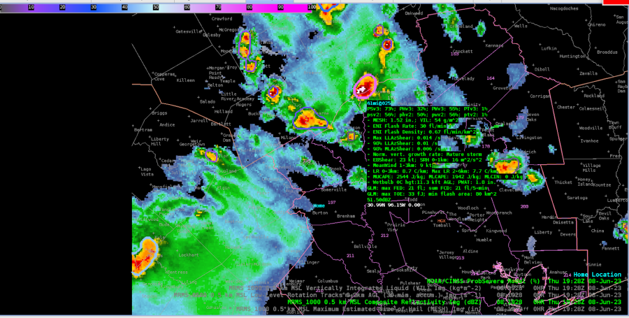
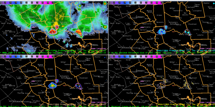
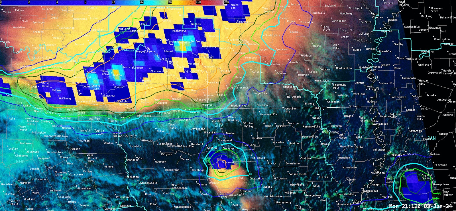
 Initial setup for the HGX vicinity showed several cells to the north and east of the DSS site, propagating southeastward. The strongest cell, pictured below, had a PSv3 of 73%, while PSv2 remained as 56%.

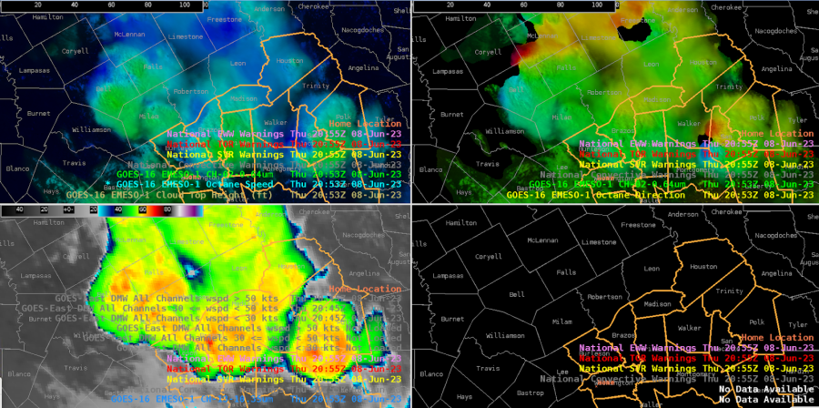
We issued a warning for a northern cell moving into the CWA into Madison county, based on a -70C cloud top brightness temp and PSv3 total prob over 70% (had been climbing from the 50s fairly steadily). But the cloud top shear noted by Octane was not strong (~20-25 kts), so the warning was very borderline. Just a couple scans later, it lost most of its texture on the vis imagery and lost its shear in the Octane direction product. Cloud tops warmed a bit as well.

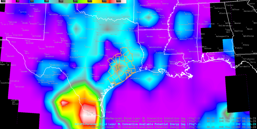
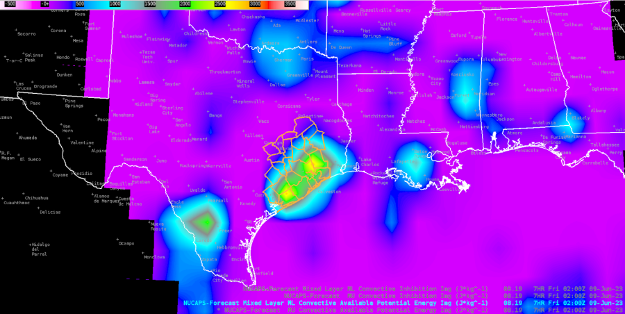
00H NUCAPS-Forecast (NF) is showing moderate CAPE now (1st image below), which may help explain the messy sub-severe multicell clusters, but the forecast valid at 02z this evening shows a resurgence in the CWA (2nd image below).

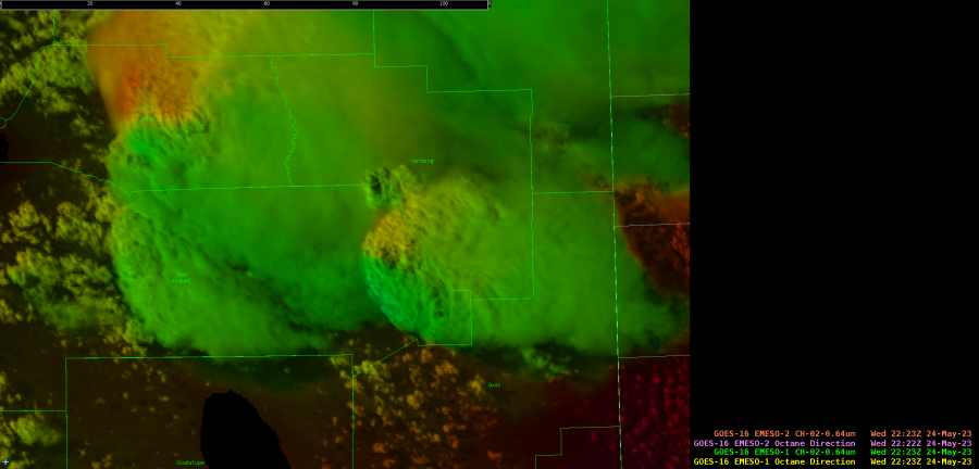
Looking to our NW, one of the stronger cells is outside our CWA, but the Octane direction is showing good cloud top diffluence.

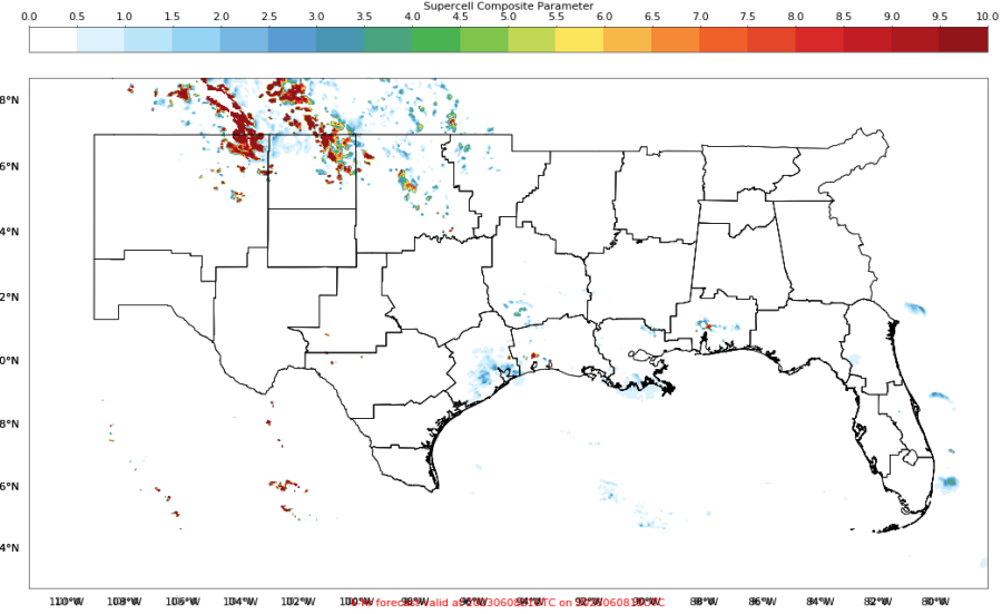
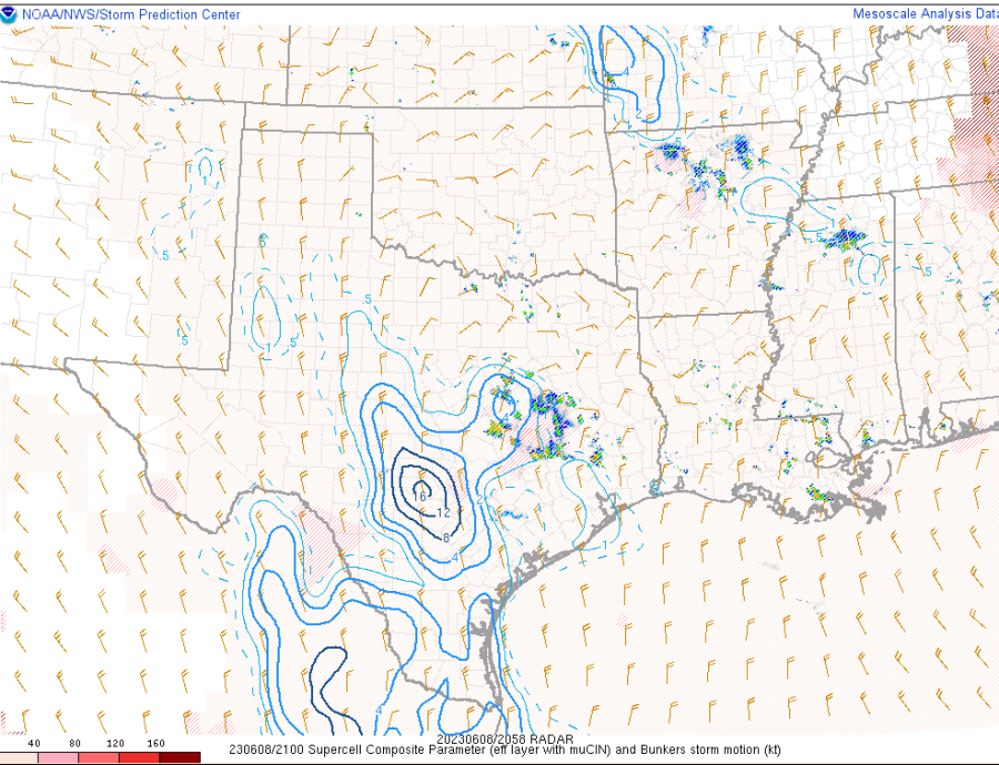
The PHS SCP forecast valid at 20z looks to be around 2-4 over our area, although this doesn’t match well with the SPC meso page SCP, which focuses high values W of our CWA.

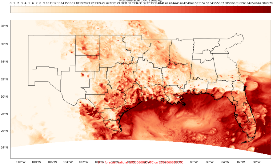
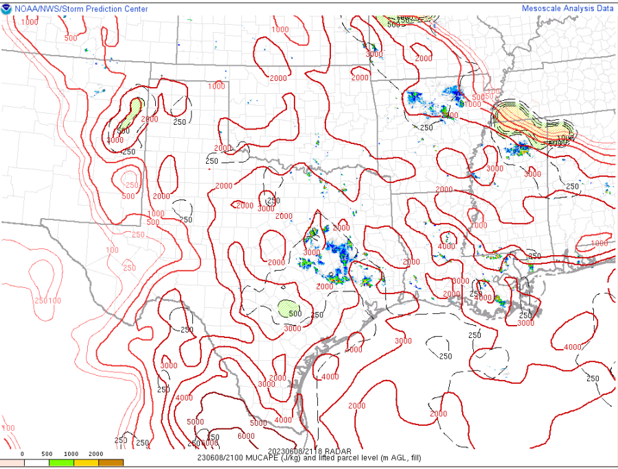
The 21z PHS MUCAPE (15z run) looks like it has insane values of 6000-7000 J/kg near the coast and just offshore. This is much higher than the SPC meso page, showing 3000-4000 J/kg at most.

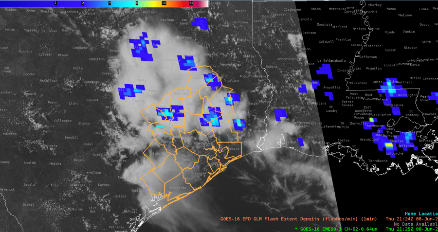
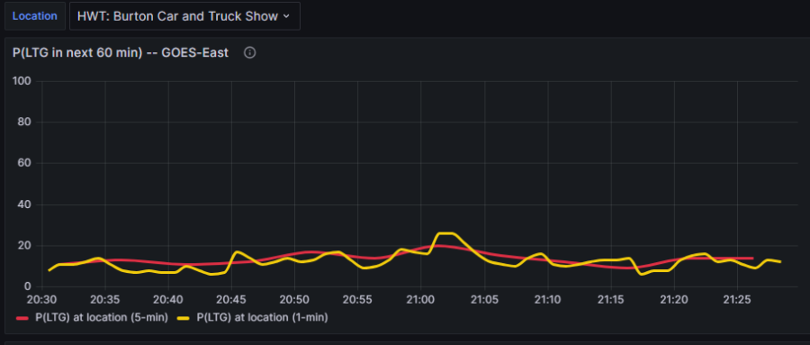
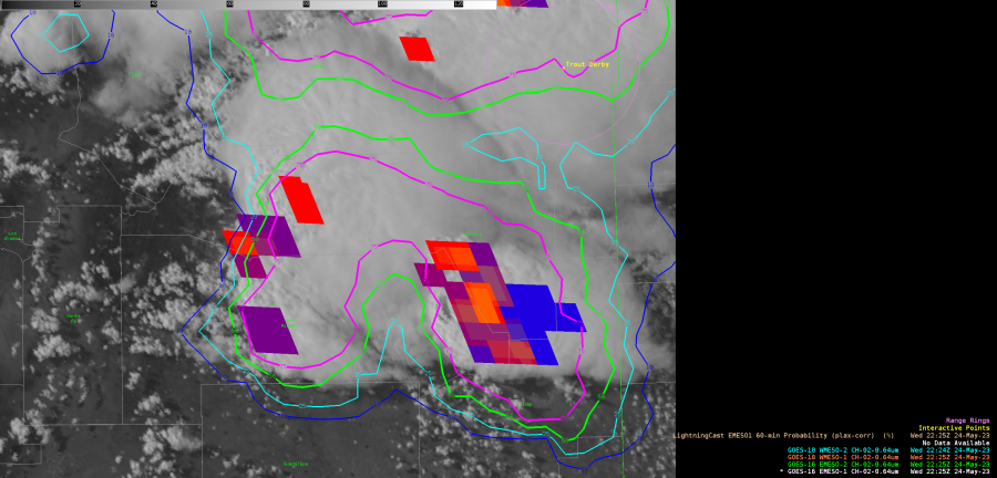
Looking at the optimal application of LightningCast, it seems that the point-based meteogram would work best for CI and in situ developing convection, versus storms propagating into the area. In our case here, at the DSS site, the point-based LC probs are low, suggesting little concern. But we can see from the GLM FED data that there are mature cells with lightning just to the NE that will probably move near the site in the next hour, which certainly poses a safety concern.

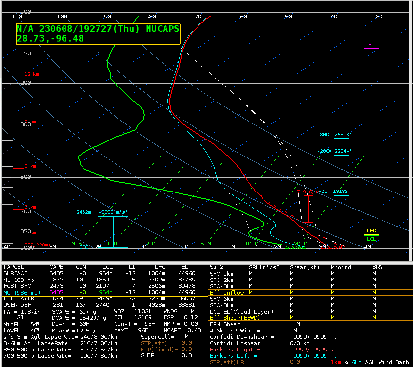
The NUCAPS sounding near Victoria (far SW CWA) showed a lot of CAPE and DCAPE, but a rather dry profile. This is confirmed by WV imagery over much of far S TX.

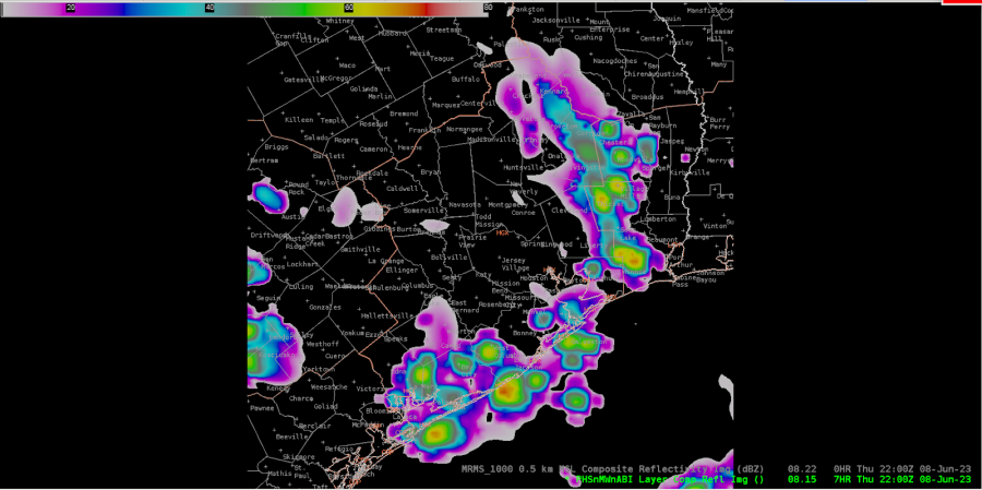
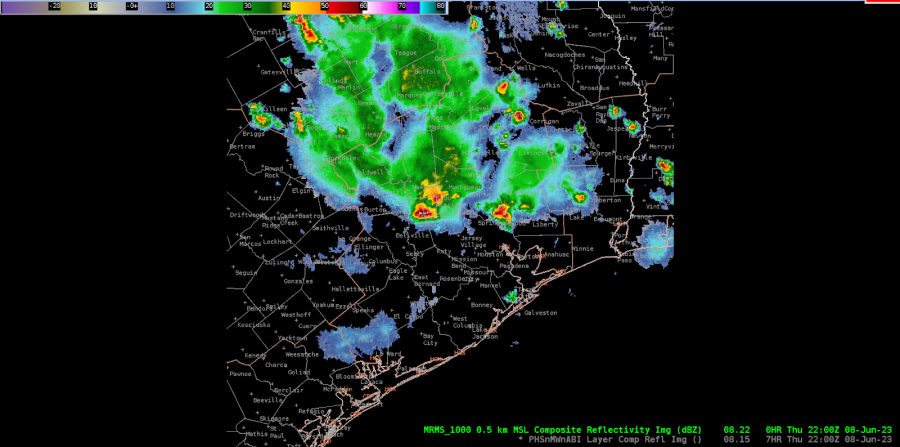
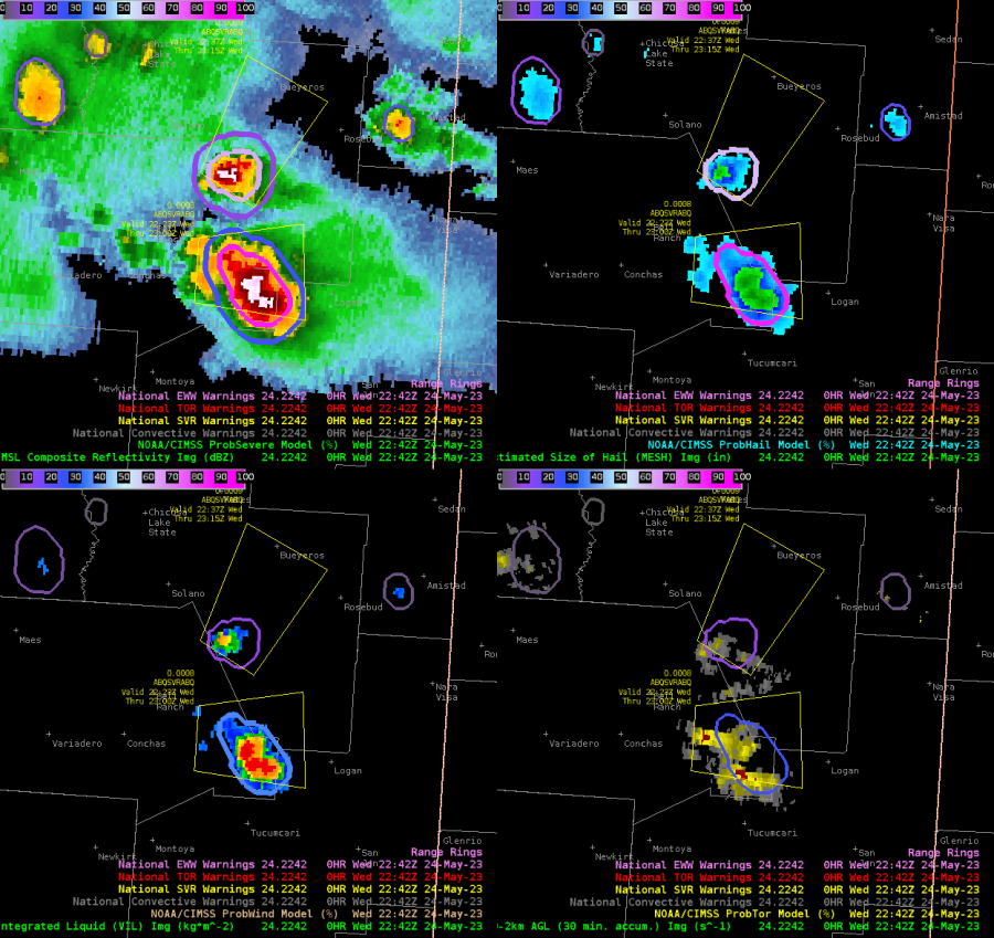
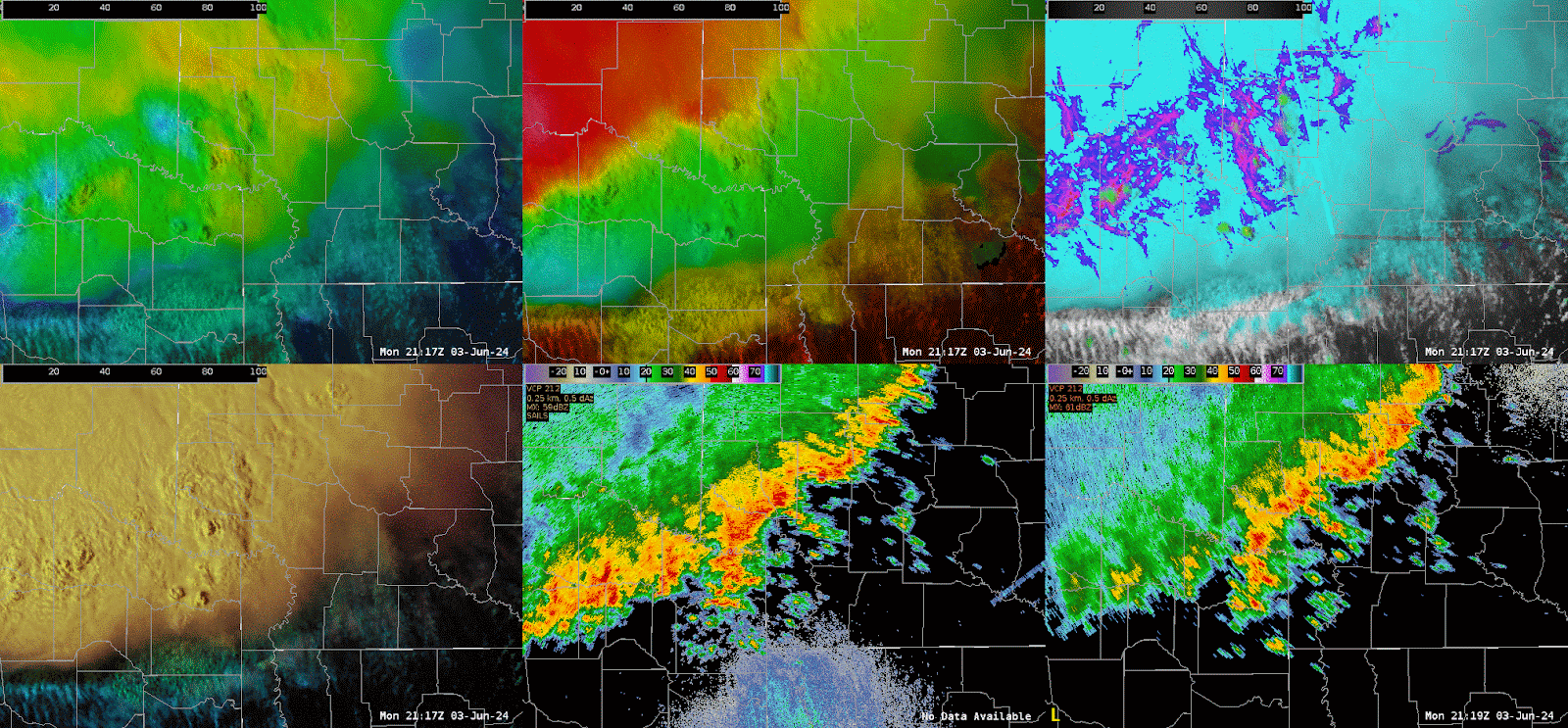
22z PHS Composite Reflectivity (above image) compared to 22z MRMS Composite Reflectivity (below image ) depicting PHS struggling on timing as the cluster of thunderstorms propagate from northwest to southeast.

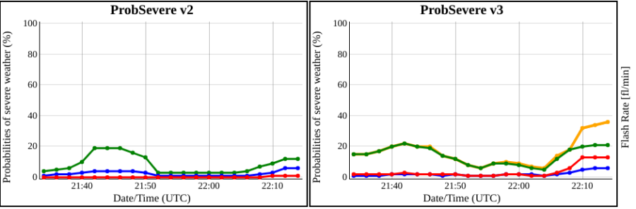
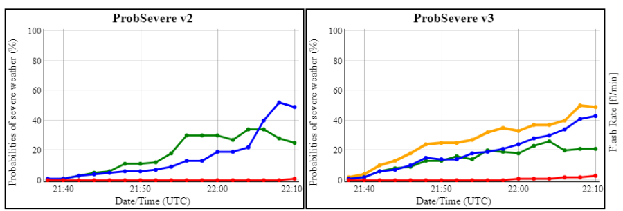
Late in the event, this cell is showing slow strengthening on PS -- currently both v3 and v2 have 40% total.

- Edgar and Harvey Specter

Thursday, May 25, 2023

Using Octane, GLM, and ProbSev for Warning Operations with Very Little Radar

 A severe thunderstorm warning decision in eastern New Mexico was a challenge today as it was within a KABX beam blockage and the eastern NM radar, KFDX, was down. The signs of the intensifying storm were found on satellite, GLM, and then slowly ProbSevere as the radar reflectivity heights from KAMA (the nearest valid radar) were very disorganized and slow to respond compared to the trends depicted by satellite and GLM trends. An above anvil cirrus plume, IR thermal couplet, consistent GLM FED/MFE signature, and cloud top divergence depicted by the Octane Speed/Direction product showed signs of strong convection developing. While reflectivity below showed just a minimal 50 dbz core and no 60 dbz core. As ProbSevere V3 gradually increased to around 35%, the ProbSevere ​Satellite Growth/Intense Convection Prob. quickly ​increased. The satellite growth/Intense Convection is not weighted as high in V2 and because of that ProbSevere was much lower at the same time.  While the radar reflectivity core was still missing, we decided to issue a warning for the storm given the other satellite based signatures. ProbSevere V3 began to show strong chances for severe weather approximately 13 minutes after the warning was issued, and a strong 60 dbz core developed on the KAMA radar shortly after with MESH getting as high as 3.5 inches.

GOES-16 Octane Direction.

GOES-16 Octane Speed.

GOES-16 GLM RGB

KABX 0.5 degree reflectivity.

KAMA 0.5 degree reflectivity.

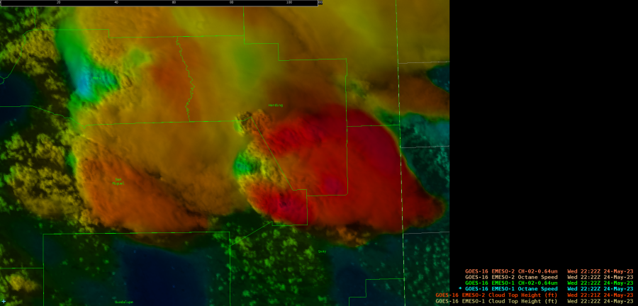
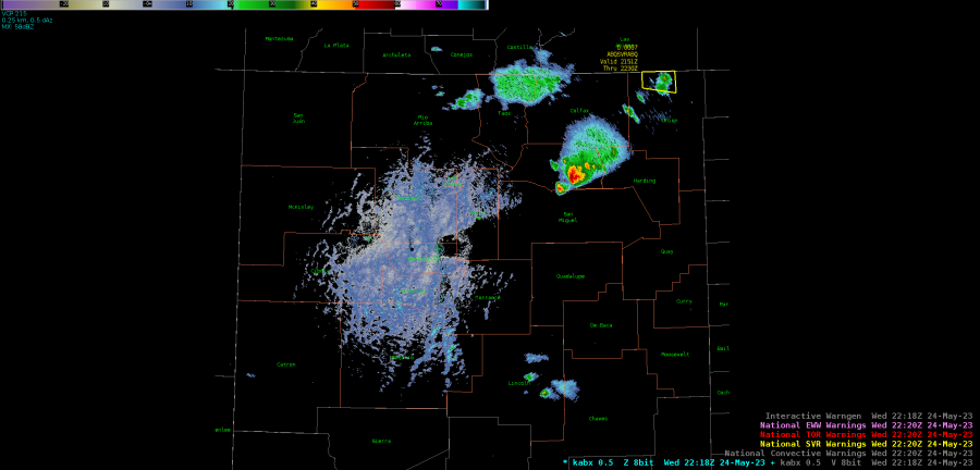
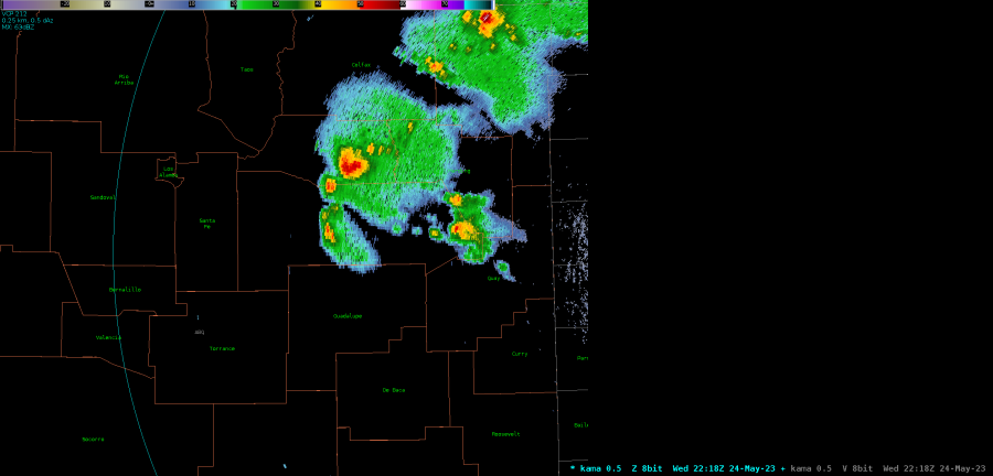
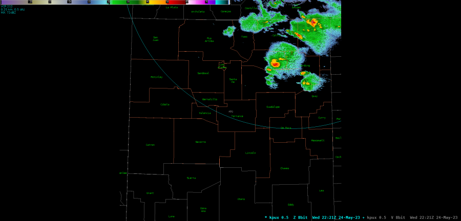
KPUX 0.5 degree reflectivity.
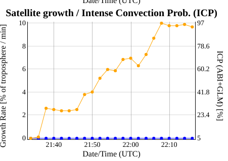
 

​_

ProbSevere probability charts.


MRMS output showing radar data approximately 20 minutes after warning issuance.


-Thunderstruck

- Joaq

Using GLM to decide to issue an SPS

 GLM RGB showed the progression of a developing storm near the TBW DSS site this afternoon. Not only was lightning a threat communicated to the DSS site, but KTBW radar depicted a downburst signature as shown below, which prompted us to issue an SPS for wind to around 40 mph, frequent lightning, and heavy rain.  track a developing storm near the Florida State Fair

-Joaq

Using GLM to track thunderstorm life cycles

 GLM FED/MFA RGB here shows the rapid thunderstorm life cycles in the weakly sheared but highly unstable Florida atmosphere, as reds to yellows (intensifying convection with lots of short cloud flashes) give way to blues and purples (weakening convection with fewer but longer flashes). The range rings circle today's DSS event, which also highlights the difficult nature of producing storm by storm headlines or products for public safety as the life span of these thunderstorms are brief. The messaging for today highlights the consistently sporadic lightning threat for anyone on the coast or at the DSS site while storms build and collapse over a matter of minutes.

-Joaq