Friday, June 17, 2022

Observations from BUF on Thursday June 16th

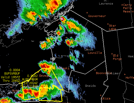
 Optical Flow Wind Storm Top Divergence Can Aid in Warning Operations

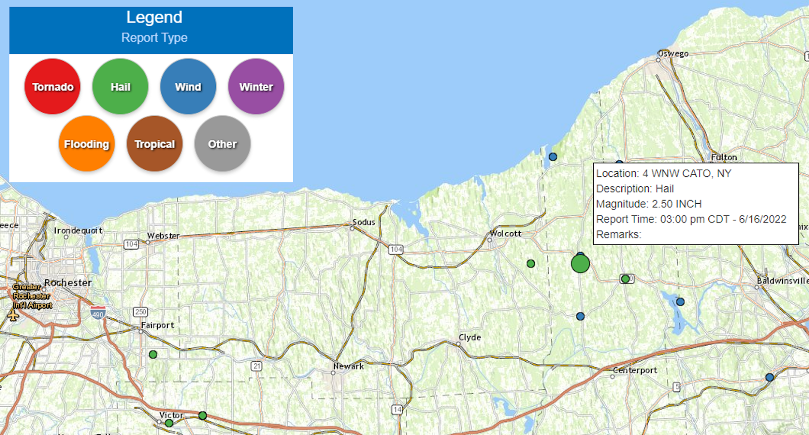
The storm of the day produced a 2.5” hail stone near Cato, NY.
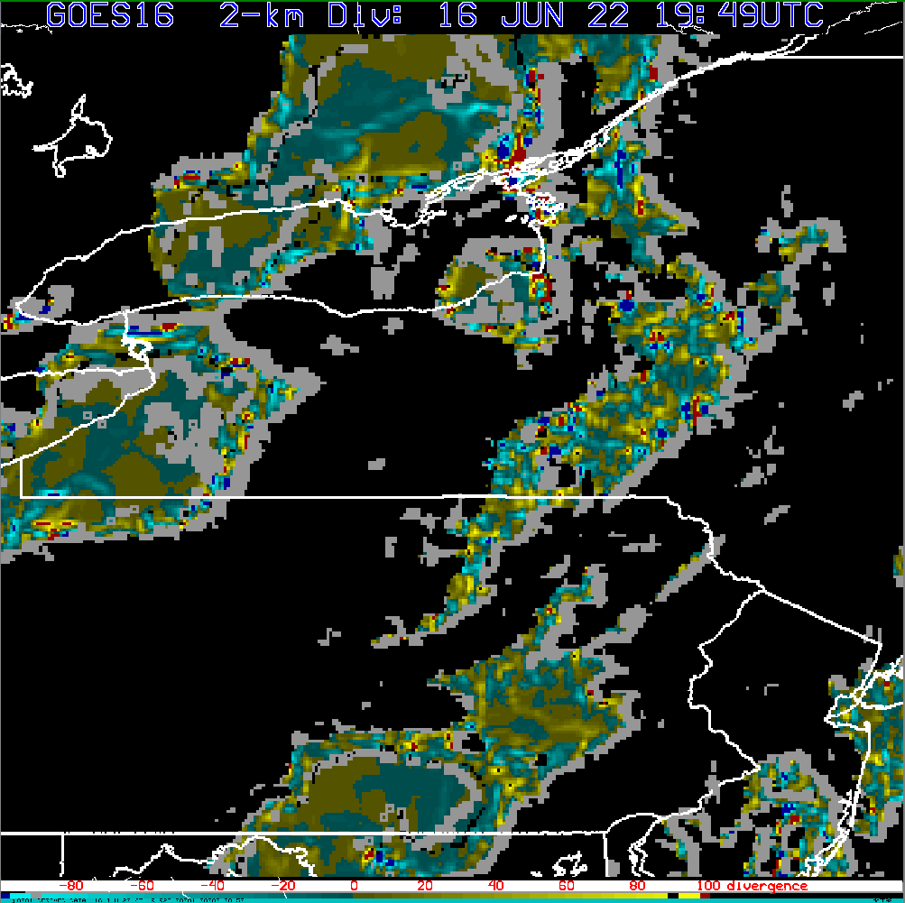
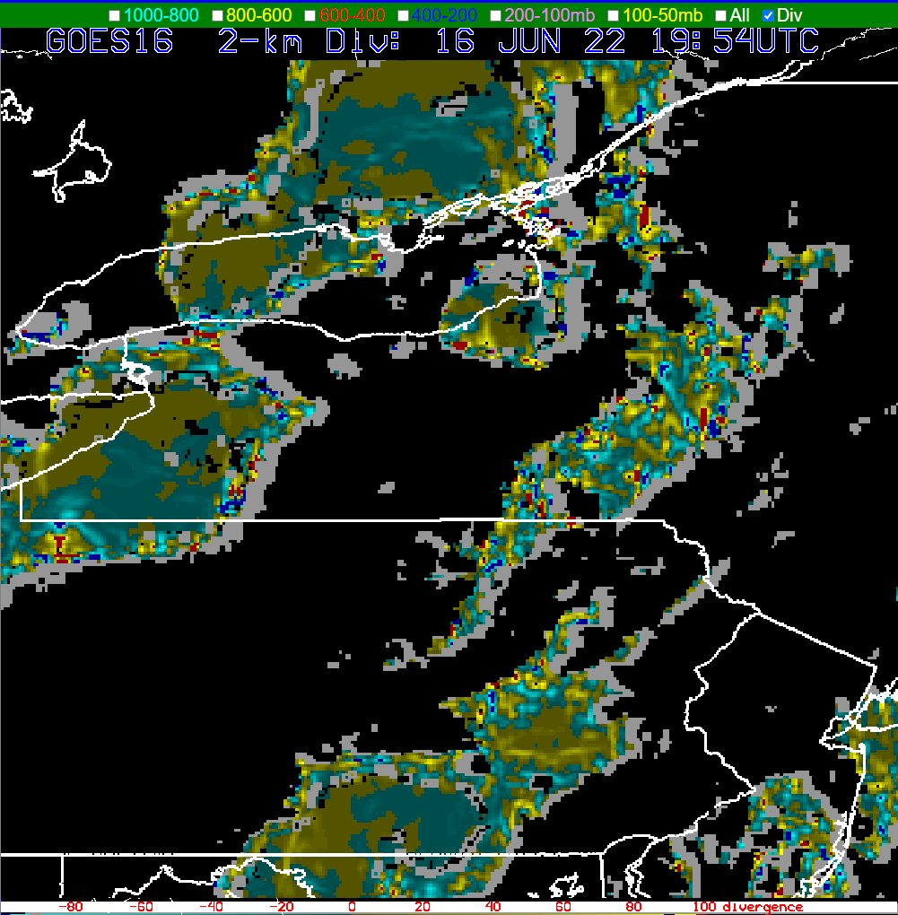
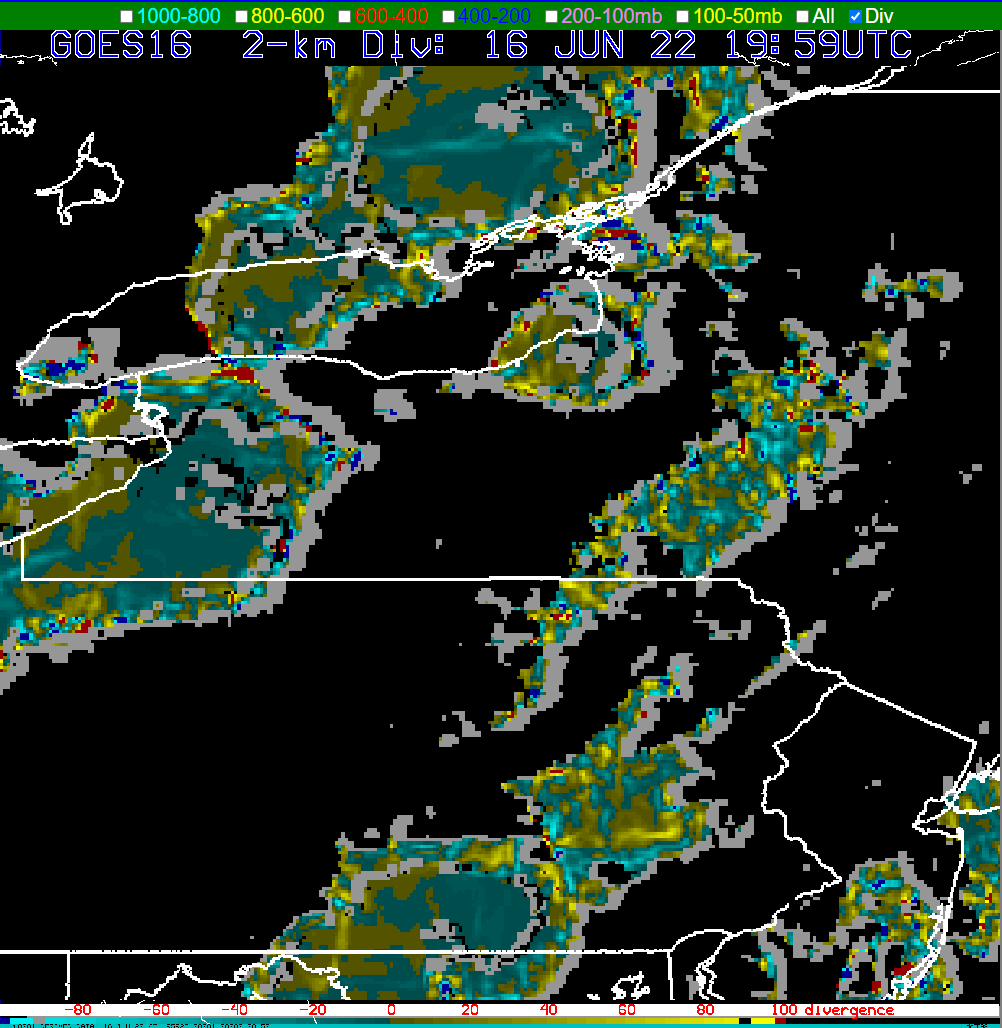
Strong storm top divergence signals an intense or intensifying thunderstorm. Matched with upper level radar scans, satellite interrogation (clean IR), and ProbSevere, optical flow wind products may be another tool to aid the warning forecaster and/or storm scale mesoanalysis,  Below are the corresponding optical flow wind storm top divergence images approaching 4 PM EDT (3 PM CDT) when the sig severe hail was reported. The thunderstorm of interest is centered just south of eastern Lake Ontario.
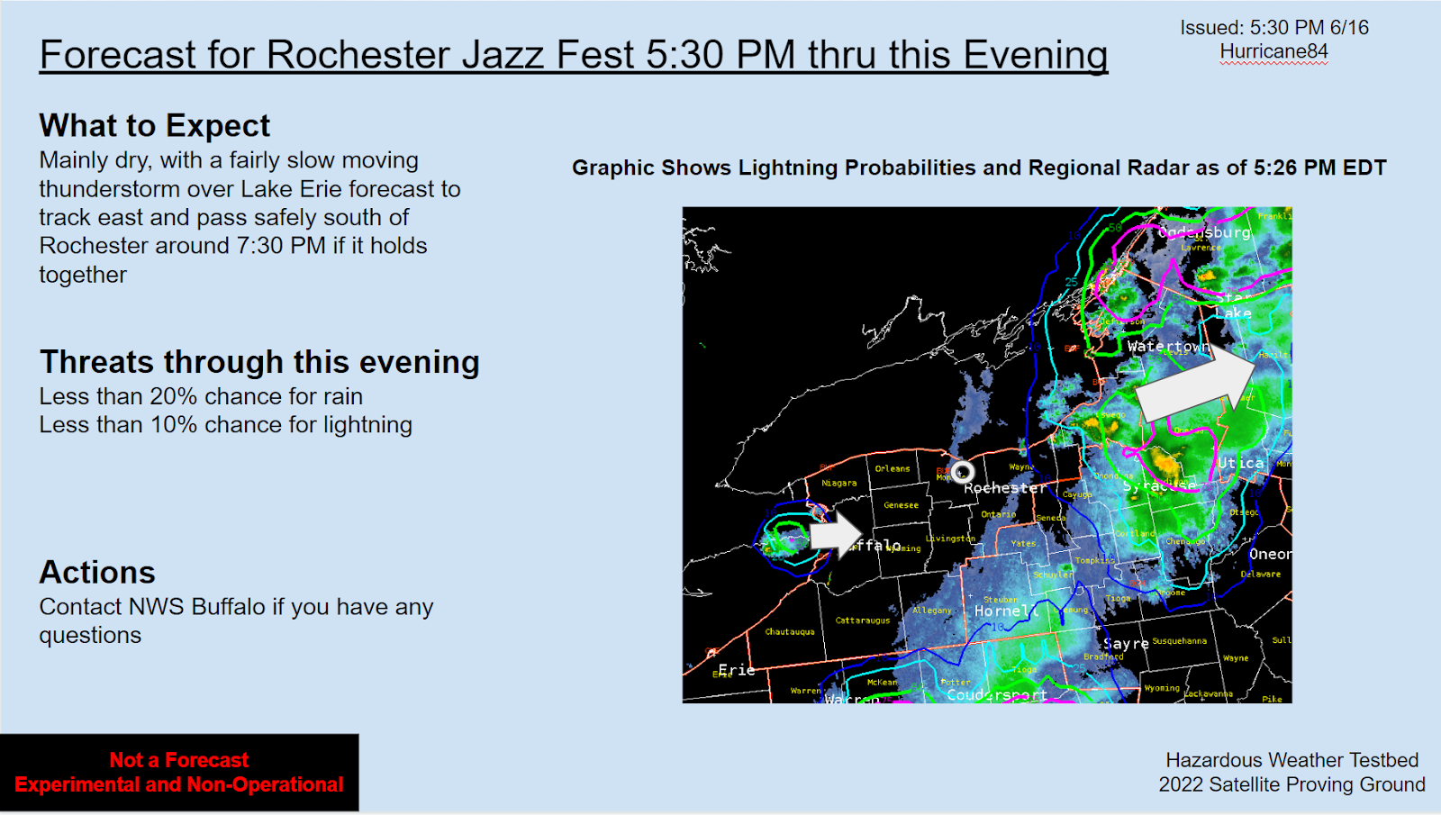
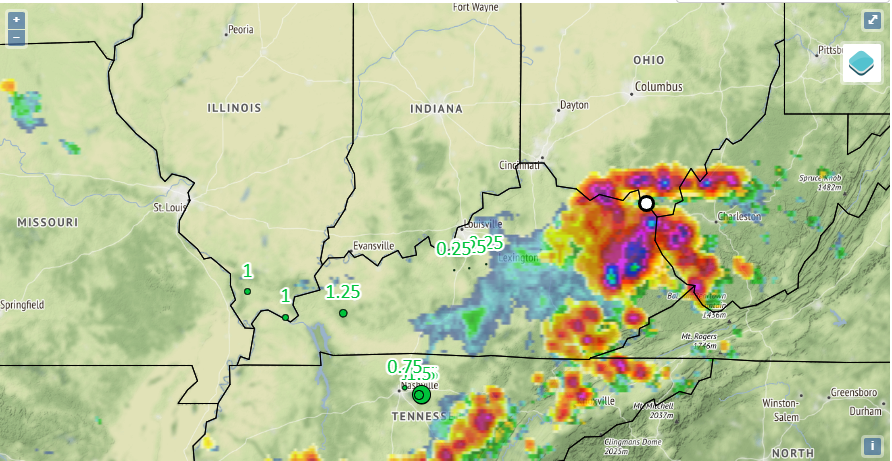
LightningCast as Graphical Messaging/IDSS Tool

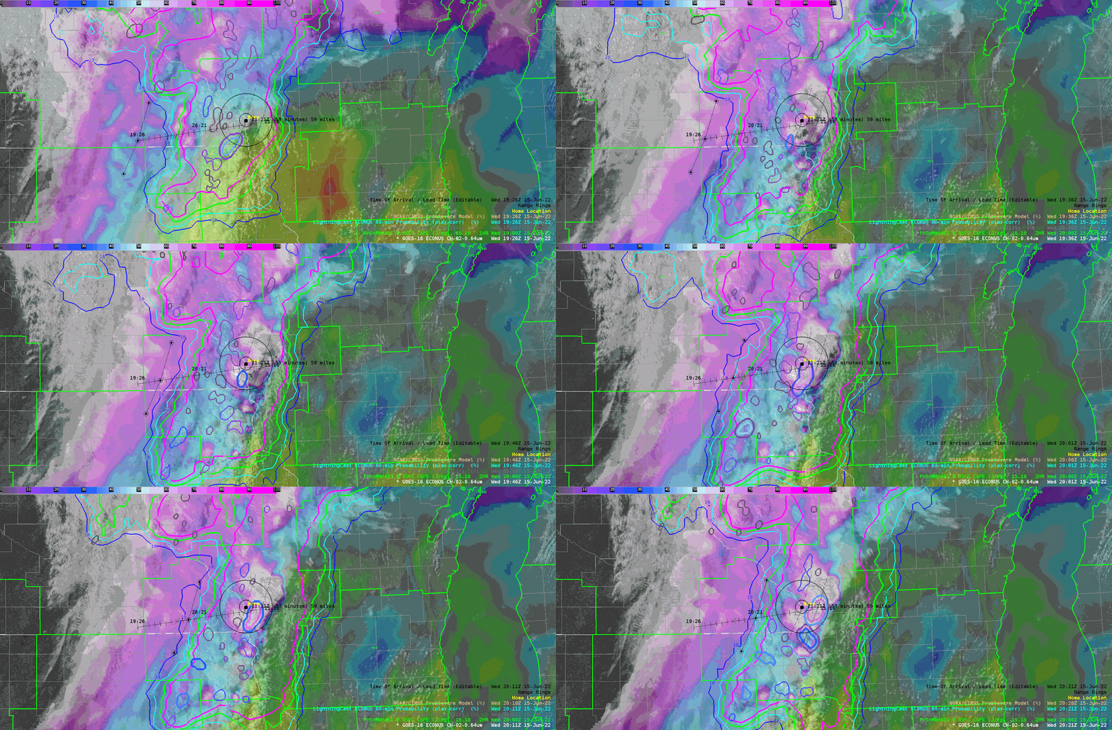
As the DSS and graphics person for BUF, I took the opportunity to highlight the utility of LightningCast for Graphical NowCasts and DSS graphics. The fairly broad brushed nature of the lightning probability contours at the timesteps utilized for graphics I think is a positive for a few reasons: they show actionable probabilities (10+, 25+, 50+, 75+) that users can understand; the contours are akin to annotations on a radar graphic, so would be a time saver; and finally, broad brushed is a way to prompt users and partners to seek out more information, like real time zoomed in radar data, perhaps calling or sending us a chat on NWSChat, or even simply keeping an eye on the sky and listening for thunder. The parallax corrected product in the images below I feel would be more useful for graphics of the nature shown below. Ultimately, for operational use, there would probably need to be some work done to ensure they are not confusing to the user and aesthetically pleasing.
Graphical NowCasts for our websites and social media
Graphic for IDSS Event

A Case for the Sharpened GLM FED Color Scale Used this Week

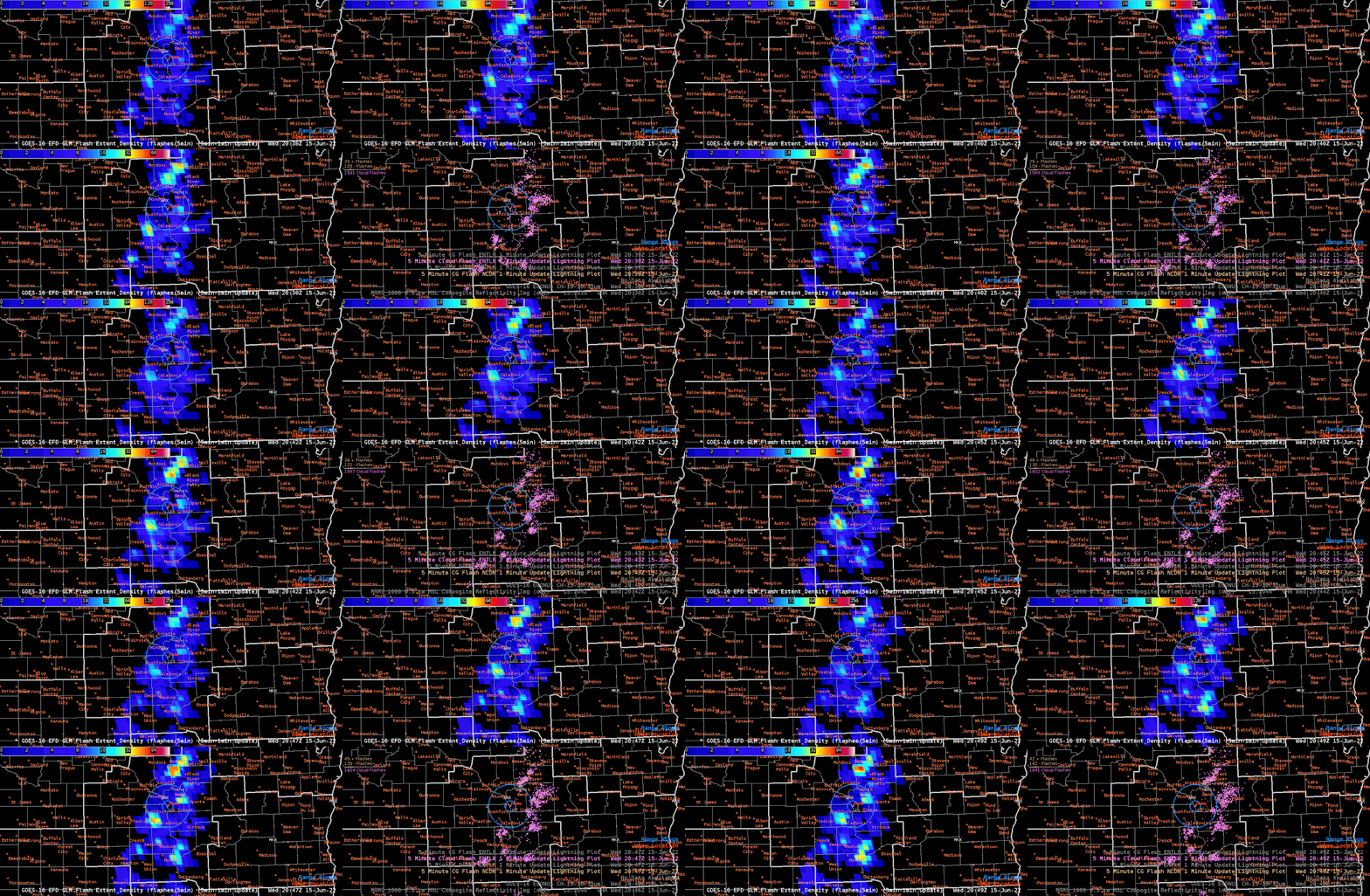
Over the course of satellite product interrogation this week, the GLM FED stood out as one of the most useful products.  Below are examples from in/near the BUF CWA at 2043z and 2047z. Note that the top of the color scale was set to 128 flashes/5 min over the grid point vs. the default 256 flashes/5 min in AWIPS. The FED also paired well with the MFA and TOE on this 4-pane procedure.

The color curve used this week really popped and correlated well with frequent ENTLN detections. Another example below from shortly after 6 PM EDT (2202 and 2207z)  shows that there will be instances where perhaps an even small color bar range would be useful.
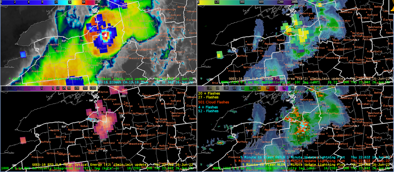
While the strongest storm at this time still showed up well on the AWIPS default color bar range, the 128 flashes/5 min top end of the range (top right) helped it pop even more and corresponded well conceptually with the ENTLN cloud flash detections. Furthermore, the thunderstorms to the north of the strongest thunderstorm showed up better from an SA perspective, if you have been focusing on the strongest storm for warning ops. The smallest color bar range on the bottom left further enhances the above described effect.

Addendum: GLM Flashes and a more smoothed FED

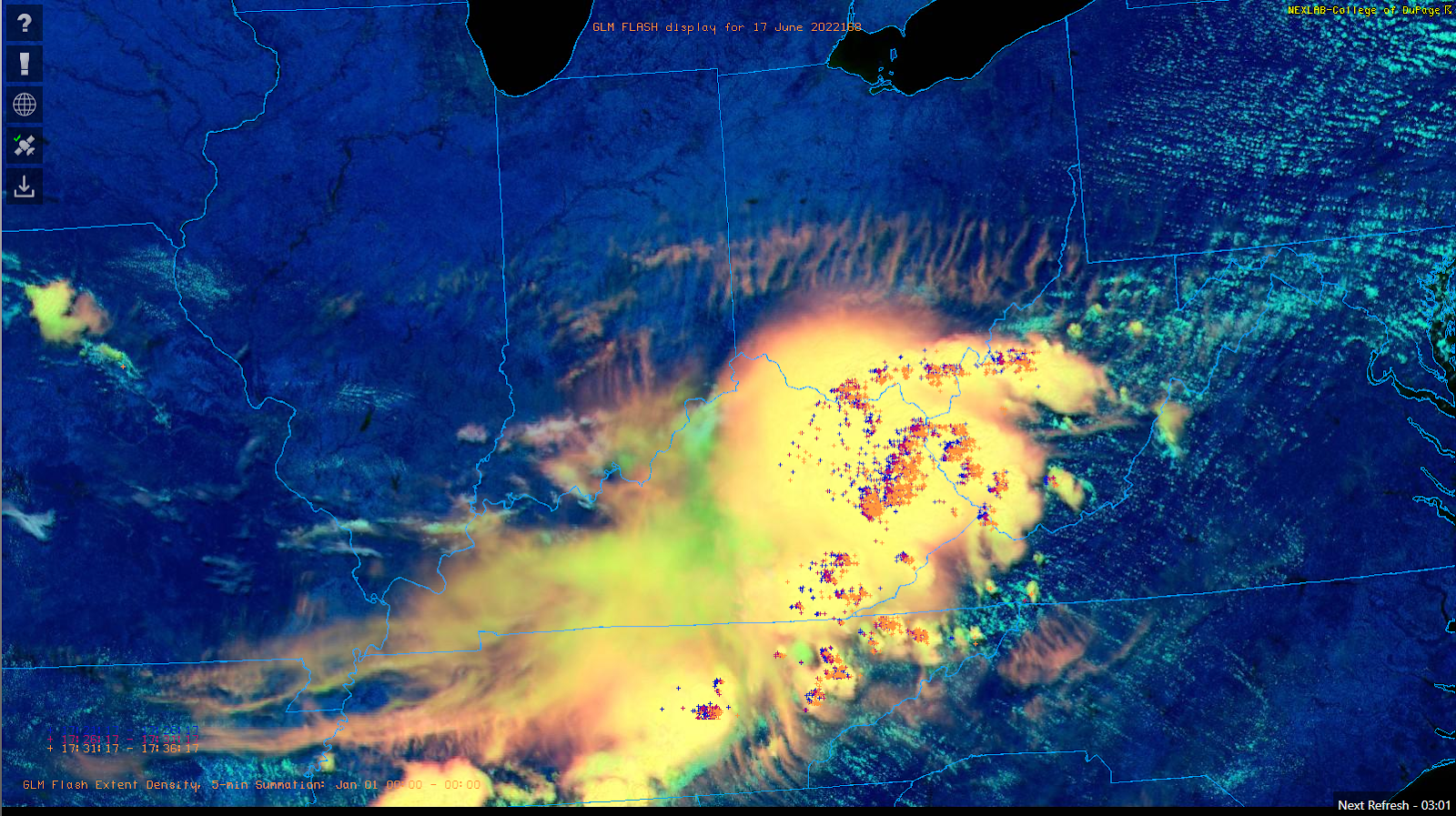
The excellent COD NexLab Satellite and Radar page added within the past year the GLM flash centroids to their GOES derived overlays. From an apples to apples perspective with respect to the ground based lightning detection network displays, this may be a useful product to add into AWIPS.
\

Addendum 2: Would a more smoothed FED be preferable?


Below are a few web based examples of FED displays.


A case can be made that these smoothed FED examples would be somewhat less obtrusive than the default AWIPS FED display, especially for storm scale interrogation by the warning operator or storm scale mesoanalyst.


- Hurricane84
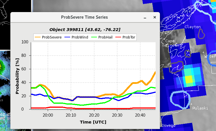
GLM & Prob Severe in Low Radar Coverage

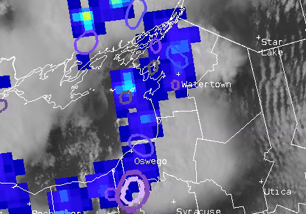
 With the Buffalo CWA being a long and narrow forecast area, there are areas where the Buffalo Radar doesn’t provide good coverage. On a day like today where their second radar (KTYX) isn’t providing any data, the entire eastern half of the CWA has the Buffalo radar hitting storms at 20 kft or higher. This meant that we had to more heavily rely on Satellite data for warning operations.


Looking at the northeast corner of the CWA we had convection popping for a few hours along a frontal boundary. Being able to look at spikes in the GLM over time and Prob Severe time scales and just instances in the Prob Severe were very helpful with determining what was going on in the lower levels that weren’t visible on radar. As one storm over the lake begins to move inland there is a jump in the GLM and Prob Severe.

Being able to see the upward trends in time with the prob severe over time and then the increasing GLM was a big confidence boost to put out a warning.

-Cirrus Fields


Gridded NUCAPS Cross Sections

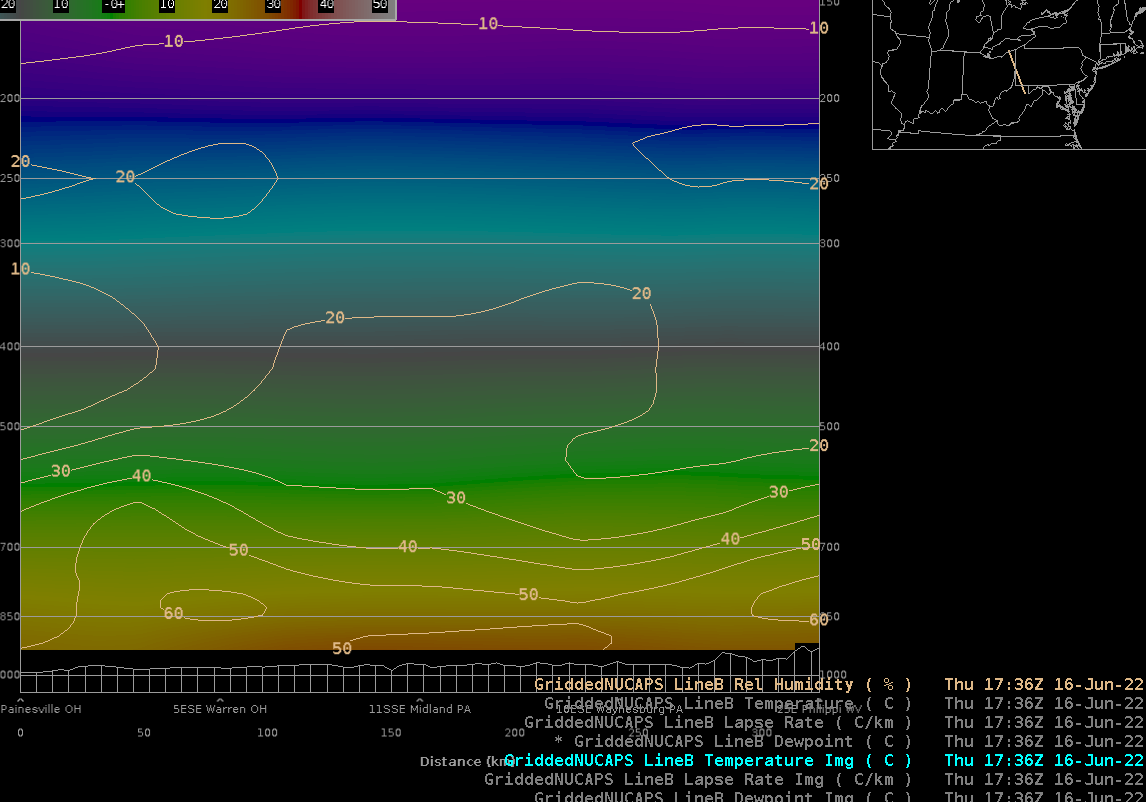
 It took until the end of the week to think of trying this, but it turns out that the AWIPS cross section tool works with gridded NUCAPS (and it turns out some folks have already been using it). Mainly this suggests the usefulness of gridded NUCAPS at spatially comparing many sounding points (rather than the somewhat klunkly process of loading many soundings into NSHARP).

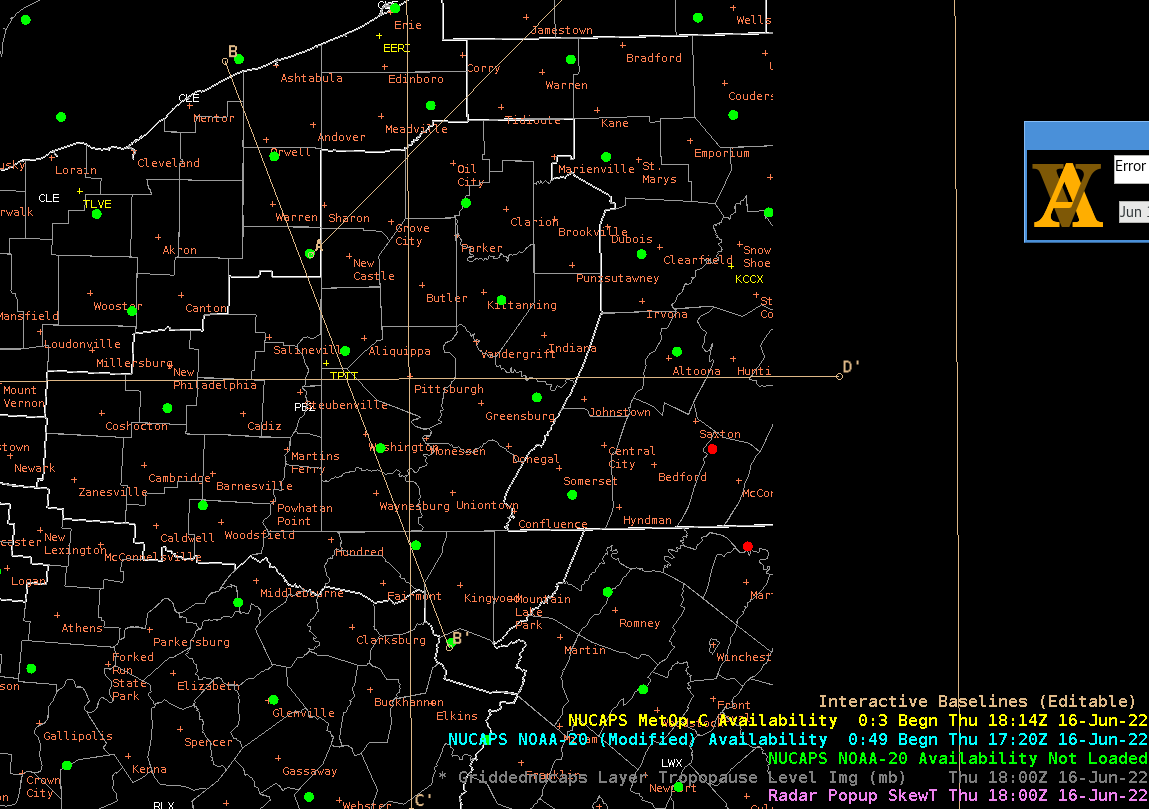
Here’s the cross section used to sample the ~1730Z NOAA20 NUCAPS soundings (lineB). Initially I thought the cross section would actually interpolate the 7 sounding points, but later I realized that the griddedNUCAPS would be sampled across the lineB.

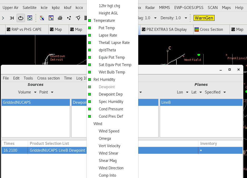
The AWIPS volume browser (in cross section mode) allowed me to select griddednucaps as the source, and then both native and several derived parameters for display, and then of course the baseline (i.e. lineB) along which to calculate the cross section.

The main challenge with this workflow is knowing to find the exact time where your griddedNUCAPS is valid.  I loaded up griddedNUCAPS in a regular D2D panel to see that it was valid at 1730Z, then I increased the framecount of my cross section enough to allow me to step back in time to that point. Then, voila… I was able to plot images and/or contours across the line I’d drawn on the map.

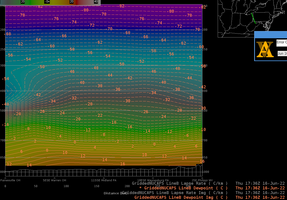
Above: Cross-section of griddednucaps over ~7 sounding points, showing dewpoint as both image and contour

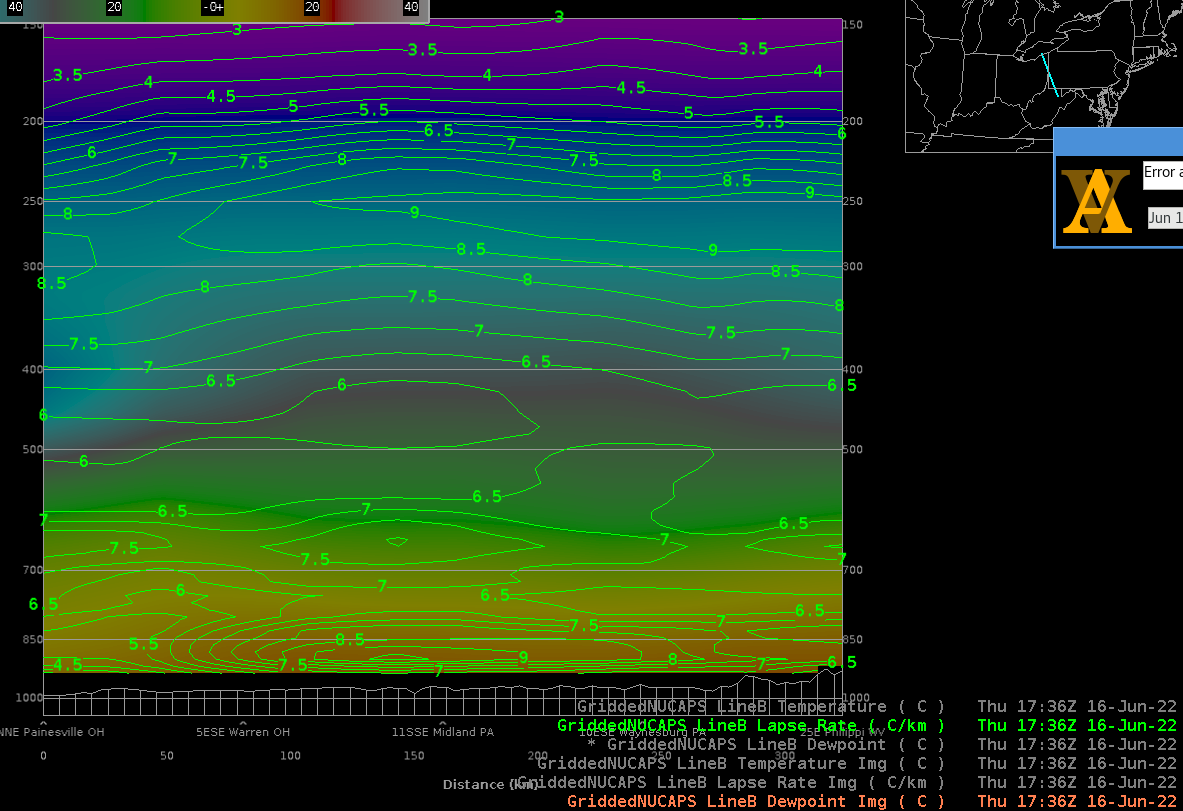
Above: Cross-section of griddednucaps over ~7 sounding points, showing dewpoint as image and lapse-rate as contour

Above: Cross-section of griddednucaps over ~7 sounding points, showing Temperature as image and relative humidity as contour

- Buzz Lightyear

A case for NOT changing the GLM image range

Storms going up across NY State have been trending upward with time.  So much so that we’ve gone beyond both the 65  and 130 flash/5 min rates:

179 flashes/5 minute north of Syracuse.  That’s pretty impressive!  And it’s been trending upwards so the lower left pane with the image scale up to 65 has been blown out for multiple frames.

- Pym

Thursday, June 16, 2022

Which GLM Color Scale is Best?

 One of the easiest ways to get an argument…I mean discussion…going among AWIPS users is color tables.

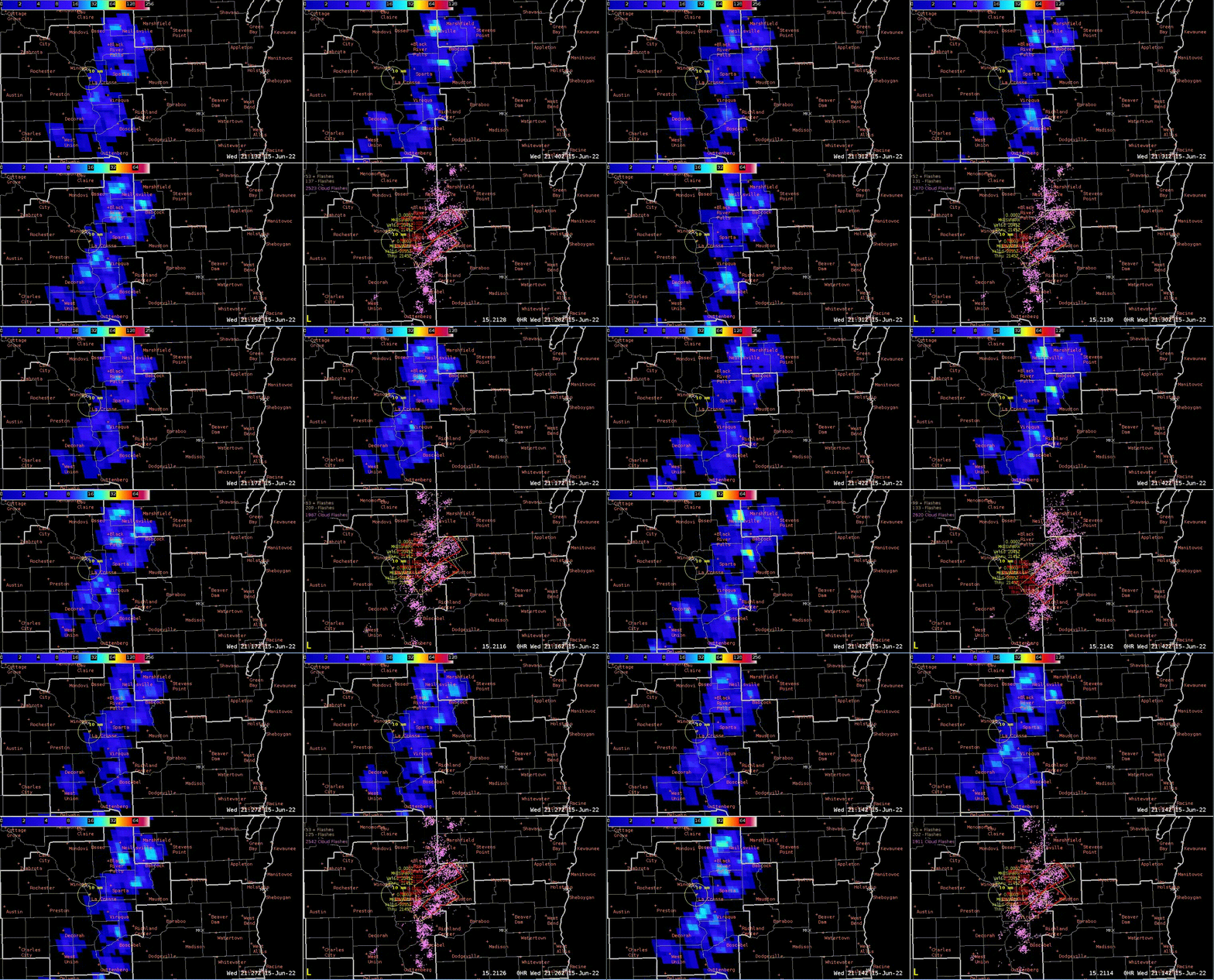
However, in this case it does pose an interesting thought experiment because the color table isn’t changing but the scaling is.  Case in point, look at a line of tornadic supercells across Wisconsin from the GOES East GLM:

Changing the range of the color table helps pull out some details with low flash rate storms.  Although the northern storms have some higher flash rates and can be seen when the scale is set to the default (260), the southern storms with a lower flash rate can pull out more details with the lower maximum point (60).

Others this week have come up with some great ideas; developing a climatology for FED to know what the best ranges would be for the display for a given season, event type, etc.  Another thing to look at is how to best develop a table for the logarithmic scale that is used with FED with a different or wider color range.

- Hank Pym

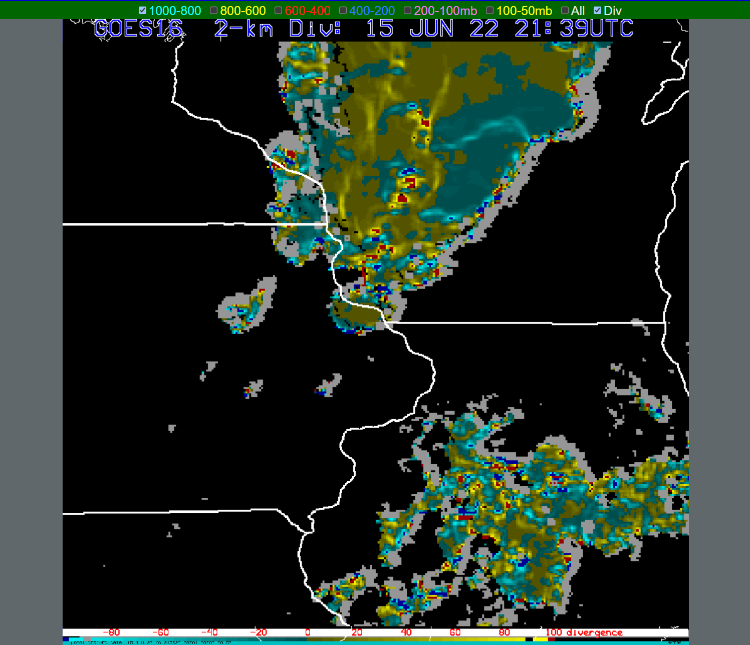
Supercells and Optical Flow Winds

 With the storms moving out of La Crosse’s CWA, I’ve got a bit of time to finally take a look at the Optical Flow Winds.  I’m intrigued by the product to say the least.

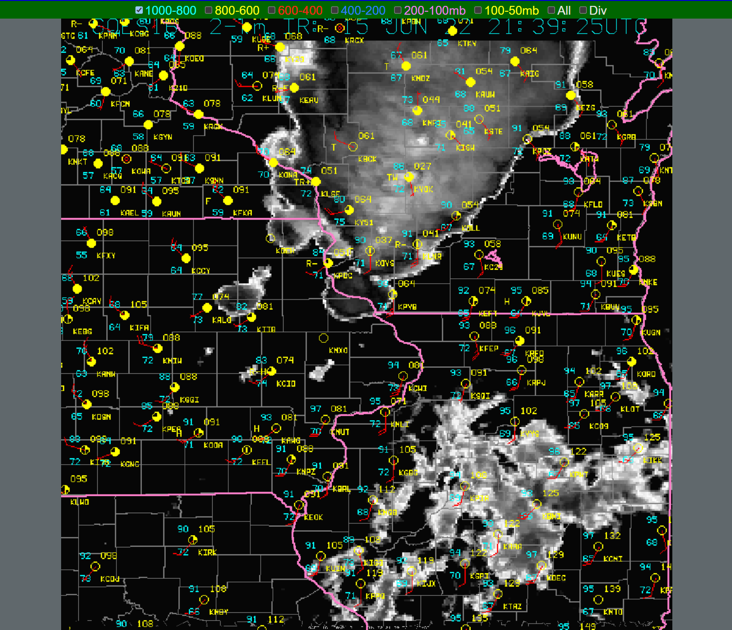
Here is a still image of the GOES-East Meso1 sector today with the string of supercells ongoing (and tail-end charlie in NE Iowa).  One thing I was curious about was how well this could detect storm top divergence.  The radar data was pretty noisy in AWIPS so it was hard to see this in those products.

Here is what the “base” product shows.

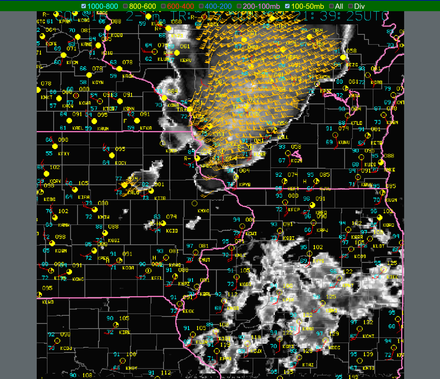
Now let’s overlay the upper-level winds as detected by this product (roughly the 100-50 hPa layer although I wouldn’t be surprised if some storm tops are going above this:

A user can also overlay lower layer wind fields to see what could be happening in those areas.  The key thing was though to see what the storm-top divergence may look like:

And that’s pretty impressive for an optically derived wind field!  Individual turrets may be showing up where there are enhanced area of convergence/divergence couplets not the ones on the edge of the cloud detection).  It isn’t perfect though:

There is a lot of variability from scan to scan on the strength of the divergence field but there is enough of a signal to figure out where the strongest couplets could be and which storm tops they could be associated with.  We couldn’t overlay radar data or the 3.9 micron “Red/visible” channel with a divergence product to make a 1:1 comparison; something to consider would be a grid that could be overlaid on a different ABI image to do a visual comparison to this product.

I’m impressed!

- Hank Pym


Pre-Convective Environment Across GRB

 With a busy day still underway across Wisconsin, the use of the Optical Flow Winds, GLM, Prob Severe, and NUCAPS soundings were a big help in looking at the pre-convective storm environment and in warning operations. 

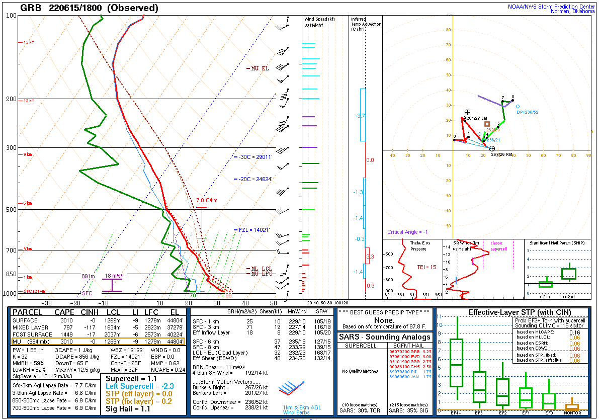
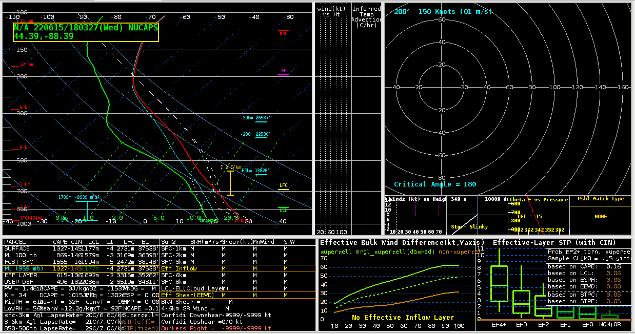
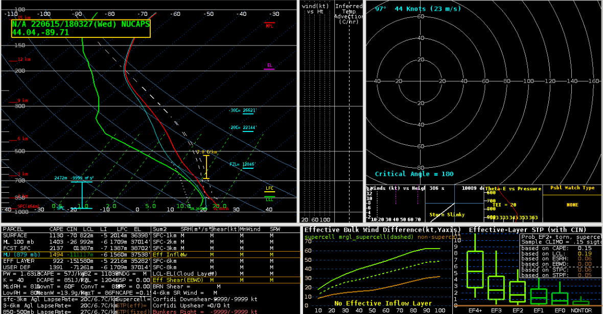
When it came to looking at sounding data we had a NOAA-20, and AQUA pass for the polar orbiting satellites, that we could then compare to the special observed sounding from GRB. 

There are some spatial differences in the locations since each satellite doesn’t pass over the exact location and the observed sounding came from the GRB office. I ended up grabbing NUCAPS soundings from west of the office where I thought the better storm environment would be. Regardless of this they do show great information over a temporal and spatial scale.

Just between Aqua (bottom image) and NOAA-20 (middle image) you can see that the environment becomes much more moist over time (AQUA came around 19Z and NOAA-20 came around 18Z). The increase in temperatures and dew points in the low levels between the two NUCAPS soundings show that there was increasing low level lapse rates and increasing CAPE through time. Then compare both of these to the special sounding sent out by GRB, you can see AQUAs vast improvement in the low level over NOAA-20. The one caveat seems to be the smoothing of the values in the mid levels. Smoothing seems to have decreased the values almost too much for both satellite soundings. It is fairly within reason given that there is a dry layer in the mid levels on the observed, but the smoothing looks to have slightly overdone it.

Moving on to the GLM, it was very helpful when boosting confidence in the warning operations. There were lightning spikes collocated with increasing rotation and reflectivity. The one things worth mentioning is to have a reminder or maybe even have offices lower/change the color curves for FED prior to the start of an event. It could even be a permanent change that some offices make.


Since I was the only one in the group to check, compare, and lower the FED color curve accordingly it was much easier to pick out lightning jumps. From the graphic above alone, 0-65 was much more informative than 0-128 or 0-260.

The last thing worth mentioning for the day was the Optical Flow Winds. While this was helpful in a warning environment to look at storm top divergence and speed of the winds at the tops of clouds, I was able to find another great use for it. In the pre convective environment I had pulled up the Optical Flow Winds and noticed that it was tracking winds and speeds of clouds over Lake Michigan. In an area where any wind information and observation data can be very sparse to near non-existent. The optical flow winds could be very helpful for open waters forecasting.


-Cirrus Fields

PHS Tornado Parameter

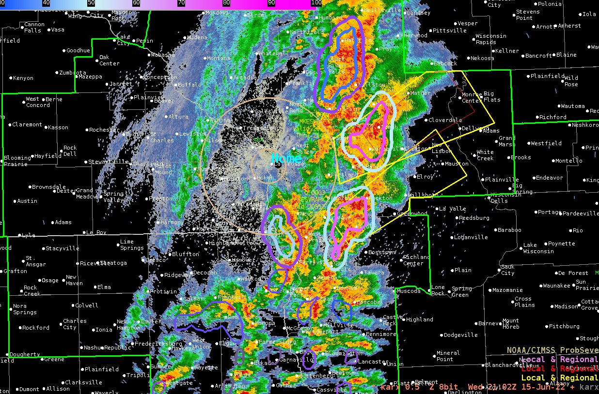
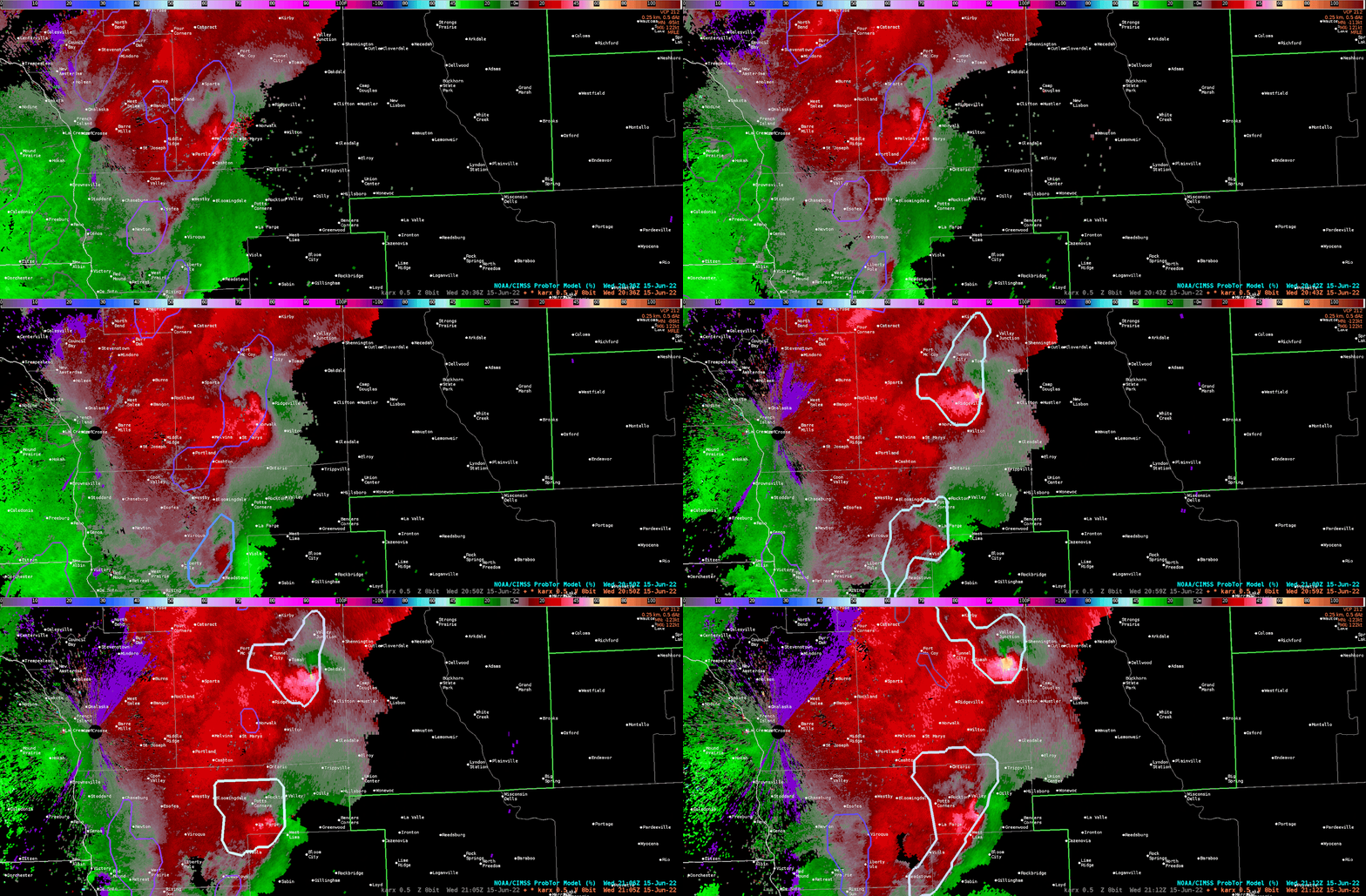
 Unfortunately I didn’t look at this PHS Significant Tornado Parameter in real time when warnings were being issued, just completely spaced it.  But went back to see how it fared during the Tornado Warnings, it didn’t do too bad.  The comparison below is from 21z and even though the tornado warning was already issued before the PHS STP was available, it was a nice “confirmation” tool of the Tornado Warning.  The units of the STP were nearly 10 at the time of the strong couplet north of Clifton, WI and it was in the right location at the time of warning.

Figure 1: base reflectivity with ProbSevere Tor Model and warnings in effect.  

Figure 2: base velocity animation of the strong couplet over Oakdale or just north of Clifton, WI.

Figure 3: PHS Significant Tornado Parameter at 21z on June 15, 2022. The circle over Clifton is a reference point for the velocity animation from Figure 2.

- PODIUM

NUCAPS Sounding Verification - Day 3 (June 15, 2022)

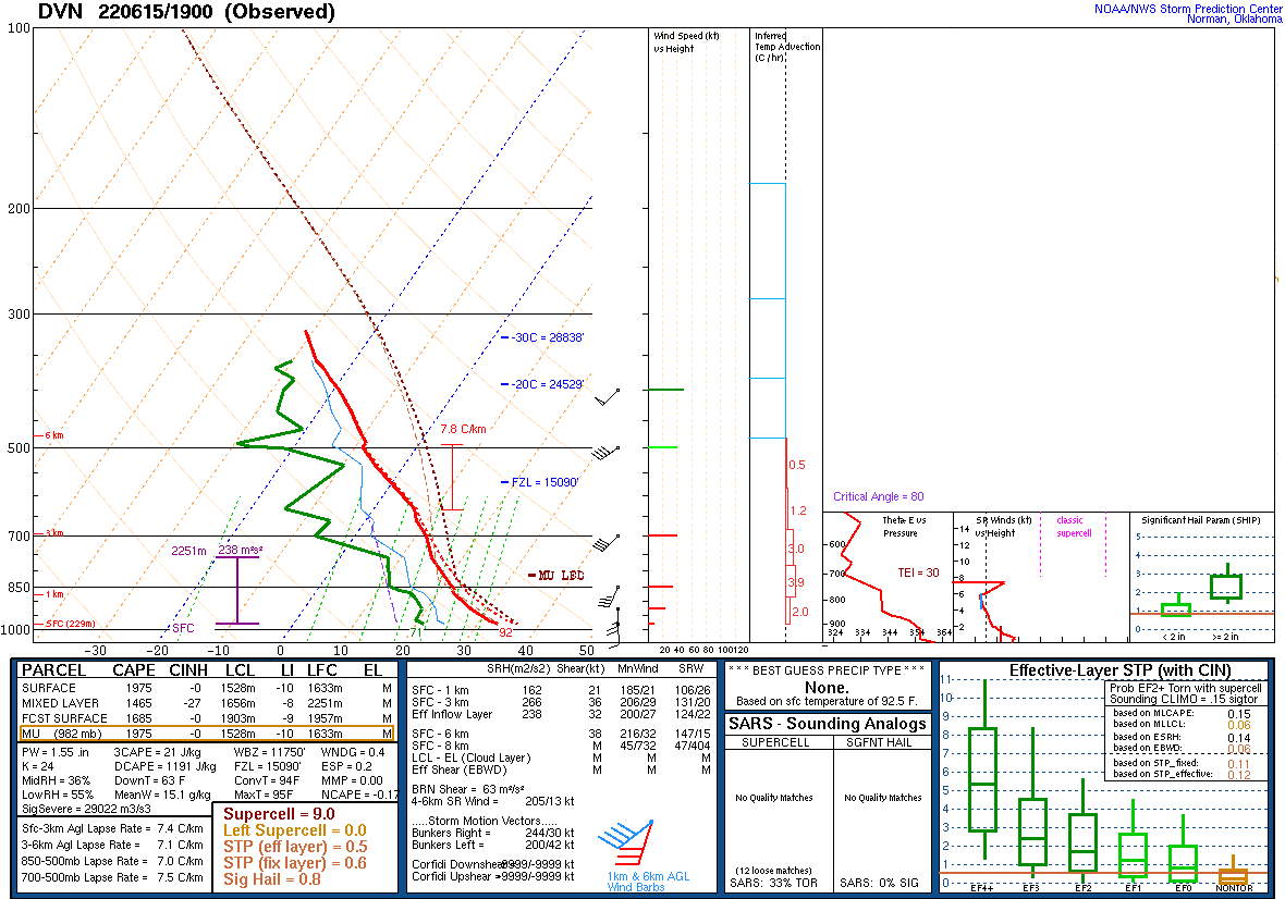
 I had a great opportunity to get some verification on a NUCAP sounding that passed through shortly after 19z on June 15, 2022.  It was the NOAA-20 which just happened to pass over eastern Iowa where the DVN WFO launched a special sounding at 19z on the same day.  I’d estimate the locations of the two soundings compared were roughly 50-60 miles apart. The DVN sounding was equidistant from 4 NUCAP soundings and all those soundings had very similar readouts from one another (see Figure 1).  One of the disadvantages of the NUCAP soundings is no winds are measured, but there are plenty of other parameters that could be compared from the two soundings. The first thing that I compared were the CAPE values (See Table 1).  The other two tables below compare other various parameters.

Some interesting differences between the CAPE values measured. Uncertain why the NUCAP sounding doesn’t suggest any 0-3CAPE values, especially since the much larger surface based CAPE.  Another big difference that really stood out was the freezing level heights and the Convective Temperature. Obviously the NUCAP sounding may have overestimated the temperature profile and thus larger CAPE values, but I found it interesting that the freezing level from the NUCAPs sounding was slightly lower. The RH values were fairly similar, particularly the midRH values, but also eyeballing the dew point temperature profile, they are pretty close near the surface.  

Overall, I do like the NUCAP soundings availability as it is another tool available for the forecast toolbox.  It might be wise (as with all things meteorology) to be careful with totally believing some of the NUCAP sounding readings after seeing this comparison.

Table 1: CAPE parameters compared from 19z soundings.  (J/kg)

Table 2: Comparing various parameters found in soundings. Note: LCL, LFC, LI, etc are all measured from the surface.

Table 3: Comparing various lapse rates and -20C/-30C heights.

Figure 1: Location of the DVN 19z special sounding and the NUCAPS NOAA-20 1921z sounding.

Figure 2: DVN special sounding launched at 19z on Jun 15, 2022.

Figure 3: NUCAP NOAA-20 sounding at 1943z on Jun 15, 2022.

- PODIUM

GLM Parallax and Lightning Cast Fun

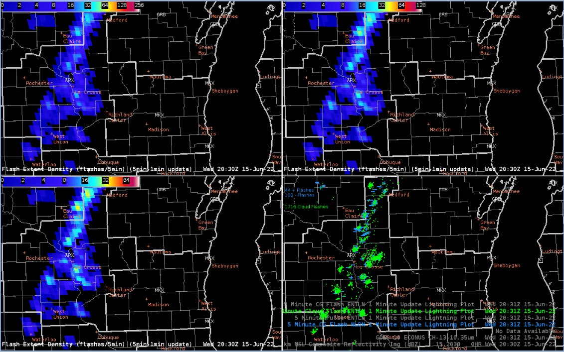
 The GLM data, specifically the FED data, was used to provide DSS to the Riverfest in La Crosse, WI.  After my first contact with the event POC, I noticed that the FED data was off by roughly a county from the ground-based lightning data.  This was my first time witnessing the parallax issue from the GLM and why ground-based lightning networks are a key component in confirming that the GLM location is accurate. In Figure 1, notice the intense concentration of the lightning just southwest of the event (20 mile and 5 mile radius rings) depicted by the GLM while the ENTLN/NLDN say that concentration is about a county south.   The parallax is evident in other lightning concentrations in and around the event circle.  I know it’s something being worked on to have the GLM data corrected to avoid this parallax issue, but it would be nice to have a map of the locations where the parallax is more evident in case you may not need the corrected version. Obviously, the further north, the larger the parallax, but not quite sure at what latitudes it really starts to show its hand. On a side note, for aviation purposes, the parallax could become problematic if the GLM lightning data is off by a factor of a county or two, especially if re-routing aircraft is occurring.

Figure 1: GLM Flash Extent Density compared with ENTLN data on June 15, 2022.

Figure 2: FED and ENTLN animation showing the GLM parallax.

I utilized the Lightning Cast to provide a probable end time of the lightning threat for the Riverfest event in La Crosse, WI.  This was a valuable tool as it provided some added confidence when the storms would exit the event area.  I did my best to line up the TOA tool with the 25 percentile contour. Once I got my estimated time that the end of the lightning threat would reach the event, then I added about 30 minutes to ensure it was well east of the event circle.

- PODIUM