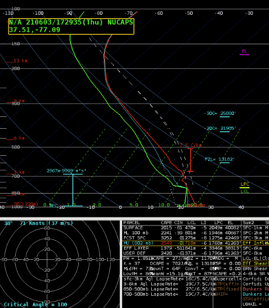
While reviewing NOAA-20 soundings, I picked a point that may have had convection later in the day. The regular sounding was fine. The modified sounding looked crazy.


– Champion
While reviewing NOAA-20 soundings, I picked a point that may have had convection later in the day. The regular sounding was fine. The modified sounding looked crazy.
– Champion
Looked at the modified NUCAPS sounding for and the low levels, below 700mb, were un representative (had an inversion when SPC mesoanalysis had no CINH), however the sky had roughly 80% cloud cover.
NUCAPS Base Sounding
NUCAPS Modified Sounding, Same Location as Above
Looking at the NUCAPS forecast, the holes in the output field due to the cloud cover. The lack of data was in a bad location, preventing us from seeing the instability potential for a line of storms coming in from the west. The gridded format was actually better to use in this case as it helped fill in the gap.
Interpolated CAPE NUCAPS Imagery
The interpolated data is easier to visualize gradients in the variables, but our experience was that some important data was filtered out by having this turned on.
The time in the lower left is 19.99z. A key for the “all” field would be helpful to understand what I am looking at.
Having the CWA borders is handy, however having it as it’s own layer would be more helpful, and separating out the CWA borders from the state borders.
Can storm names be used to correlate the time series (F6, D3) and also have the names plotted in AWIPS for the storms I am looking at a time series of; would be more beneficial than having the lat/lon
-for example, click for a time series of one storm triggers a storm ID to show up in the time series and in AWIPS
-I click another storm and another time series shows up with the storm ID in the time series and in AWIPS allowing me to see which time series goes to which storm
If prob severe and its time series could be put into GR that would greatly improve DSS services when outside the office. The AWIPS thin client is sloooow, so being able to have the same ability, or similar ability to interrogate storms as in the office would greatly help improve the quality of DSS when deployed.
Prob severe version three continues to look more reasonable for severe wind than version two
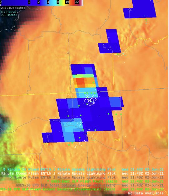
Noticed an increasing 5 minute trend in the minimum flash area that was reflected in the FED about 5 minutes later. Seeing the sustained increase in one minute minimum flash area caused me to pay more attention to that storm than I did earlier due to the sustained growth
While monitoring a storm with FED and minimum flash area, the FED suddenly went down. The same trend was not seen in the minimum flash area as easily. Maybe the minimum flash area is more useful tool for monitoring the growth of storm while the FED is better suited for monitoring the overall trend in storm strength and sudden weakening.
Downward trends in FED for one of the storms matched what was being seen on satellite of the storm updraft becoming more ragged as it weakened due to entraining dry air.
-would be great to have lightning data such as FED plotted in a time series as well so trends are more easily seen
The stronger storm we were monitoring (same as in the screenshot below), prob severe version 3 was higher than version 2 for 15 minutes atleast. Looking closer this was due to the hail category being higher than version two; version three was also higher than version two in the wind category, but not nearly as much. Toward the end of our time version two was higher due to higher probabilities in the wind category. Interesting.
We monitored this particular cell on and off throughout the afternoon and tried to gain a better understanding of the minimum flash area. We noticed a close cluster of negative strikes, which really helped as a visual aide for what the GLM was seeing. The GLM MFA was able to isolate the core of the storm really well. We combined this with ProbSevere, and watched the probabilities on this storm increase which was a further confidence booster that the storm was intensifying in addition to what was seen by GLM and ENTLN.
– Accas and Groot
The optical flow winds product had much better areal coverage than the GOES-East 000-250 mb DMW product for strong thunderstorms in the San Angelo CWA. However, it would have been very nice to have both products in virtual AWIPS to compare.
– Champion
NUCAPS…
Can there be a circle (or some reference) around the NUCAPS point that I am currently using for a sounding? That way I have a reference on the map for where the sounding is that I am looking at.
Can more than two NUCAPS sounding be loaded into an AWIPS pane? If so, would nice be able to compare soundings/environments more easily.
Having the ability to display one NUCAPS sounding when I have two loaded in Sharppy would be helpful. Even when loading two soundings and only have one in “focus” the two soundings overwrite each other. Can this setup be similar to AWIPS that allows us to have multiple soundings loaded and be able to turn one or both of them on when we choose?
Compared a couple NUCAPS soundings surface conditions to the obs for a couple locations and they look reasonable.
Looking at the forecast CAPE/CIN from NUCAPS, the gridded field for CIN is quite splotchy. Bulls eyes of much higher CIN seem overdone compared to what is expected during the mid afternoon with full sun and with what the SPC mesoanalysis has. This would make me question how accurate it is. Looking at the forecast, there is no consistent trend with the CIN bulls eyes, which lowers my confidence in this field. The CAPE field is more uniform, though still splotchy. The areas of higher CAPE are more consistent, giving me more confidence in this field than the CIN. Is there a way to average out this field more to make it smoother? If so, that would greatly increase my confidence in this parameter and my likelihood of using it in the future.
Noticed the surface based CAPE in AWIPS vs. Sharppy was quite a bit higher in Sharppy.
Compared the ML CAPE in a modified NUCAPS sounding in AWIPS and an unmodified NUCAPS sounding in Sharppy and the modified lined up much more closely with the SPC mesoanalysis page. The the ML CAPE in the unmodified sounding in Sharppy was too low. Surface based CAPE was actually more representative in the unmodified sounding.
As mentioned earlier, would be nice to compare more than two sounding points for NUCAPS to aid in comparing the environment more easily.
Having the NUCAPS 2m temperature and DP in F instead of C would be much more useable and easier to compare to surface observations.
Noticed the 2m temperature for the gridded NUCAPS was cooler by 5-8 C compared to the observations. This makes me looks confidence with the CAPE and CIN plots if the surface temperatures are not accurate. Is there a way to grid the modified NUCAPS data? When I forecast I like to view parameters in a gridded fashion in the horizontal. This helps me better understand what is going on with the environment.
Compared the NUCAPS 700-500mb lapse rates to those on SPC’s mesoanalysis page and found the NUCAPS was close, but on the cool side.
In our data sparse CWA, I can see these soundings as being quite useful, as long as forecasters understand the low levels (assuming below 850mb) are less likely to be representative.
Taking a look at the minimum flash area…
Difficult for me to really see any sort of trend with the 1 minute data. Nothing really catches my eye. The 5 minute data is much more easy to see trends.
As mentioned yesterday, am able to see more valuable information with trends in the storm than with flash density.
Looking at the optical winds…
The background is a bit too dark. Can the Lat/Lon be put below the imagery? Having it above seems to detract from what is being displayed. Adding state borders, cities, would add to the usability of this product, especially if these labels can be turned on and off.
I like being able to pan the image.
I can see this being handy for monitoring for LLWS for aviation, assuming there are clouds to track. Could this data be merged with NUCAPS to plot shear and helicity?
Changing the density of the vectors would be handy.
Color coding the different levels and matching it to the key is easy to determine what level I am looking at.
Could this track the speed of dust? If so, could help determine how strong the winds are in dust storms.
Curious why the pressure levels are broken down into 200mb intervals. Could the winds also be tied to theta levels to help with isentropic analysis?
Having contours for the winds would help limit information overload as far as what is being shown. Being able to control the density of the number of wind vectors would help, however that could lose some data. Contours of the wind vectors, say every 5 or 10 kts, could help summarize what the individual vectors are showing.
-Accas
Modified NUCAPS sounding appeared to have a better handle on the environment compared to baseline NUCAPS sounding. However, it also appears it might not be totally representative of the atmosphere given the partly cloudy conditions at the time RTMA data was pulled in. The SPC mesoanalysis page suggested MLCAPE upwards of 2500 J/kg in an uncapped environment. Using the gridded mid level lapse rate product from NUCAPS we found the data to be representative. It verified well with what was shown in the NUCAPS soundings and matched with the values suggested by the SPC Meso Analysis page.
MODIFIED SOUNDING 1927UTC – WEST HINDS COUNTY, MS




The San Angelo CWA was expecting severe convection in the afternoon. There was a NOAA-20 pass over their CWA at 1927Z. A NUCAPS Sounding in the clear air ahead of ongoing convection was chosen. The approximate point of this sounding is shown by the white circle in the left image. The sounding in the right image showed an environment very favorable for severe convection, including hail. Since ongoing severe storms were heading in this direction (left image), the storms could be expected to maintain their intensity or possibly strengthen.
– Champion
The GLM Flash Point is a unique addition to the GLM suite of products. It’s parallax corrected, which is nice. But the points seem to tell you less data per minute than the FED. In this example there are eight points for the Sterling/Irion County storm. However, you need to mouse over each point to get more data (flash duration and area). By comparison, the FED quickly tells you this is an electrically active storm. In a warning environment, with limited screen space, and where every second counts, the FED tells you a lot more very quickly than the Flash Points.
– Champion
Radar imagery showed a storm form and rapidly strengthen over Guadalupe County, NM. ProbSevere matched this intensity increase well. The storm looked like it was going to become severe. ProbSevere jumped to 60% at 2226Z, which was about a 40% increase in about 5 minutes. Surprisingly, the 60% value was the same for ProbSevere Versions 2 and 3. The modelers mentioned that Version 3 has lower values than what forecasters are used to seeing in Version 2. Therefore, a 60% value for Version 3 is probably a higher threat than an identical value for Version 2. That gave me more confidence considering this storm severe.
– Champion
Intense storms quickly spun up in southeast Minnesota in the 23:00 to 00:00 UTC hour yesterday, eventually dropping hail with diameters up to 3 inches. The environment was highly sheared (55-60 kt) and the storms straddled a gradient of MLCAPE with values from 300 to 1100 J/kg.
 |
| Figure 1: ProbSevere contours, MRMS MergedRef, and NWS severe weather warnings in southeast Minnesota. |
 |
| Figure 2: Time series of PSv3 and PSv2 for the development phase of a severe thunderstorm near New Prague, MN. |
 |
| Figure 2: Time series of PSv3 and PSv2 for the development phase of a severe thunderstorm near New Belle Plaine, MN. |
 |
| Figure 4: Figure 2: Time series of PSv3 and PSv2 for a severe thunderstorm southwest of Norseland, MN. |
Several isolated storms in South Carolina tapped into some better bulk shear, becoming better organized, as well as threatening. ProbSevere v3 (PSv3) highlighted elevated probabilities of severe before version 2 for the three storms shown here.
 |
| Figure 1: Animation of ProbSevere, MRMS MergedRef, and NWS severe weather warnings for several storms in South Carolina yesterday afternoon. |
 |
| Figure 2: A storm in eastern SC that downed multiple trees. |
 |
Figure 3: PSv3 and PSv2 time series for the storm highlighted in Figure 2. |
 |
| Figure 4: A storm northwest of Charleston, SC, which dropped large hail. |
 |
| Figure 5: PSv3 and PSv2 time series for the storm highlighted in Figure 4. |
 |
| Figure 6: A third storm in South Carolina, producing numerous wind damage reports. |
 |
| Figure 7: PSv3 and PSv2 time series for the storm highlighted in Figure 6. |