LightningCast
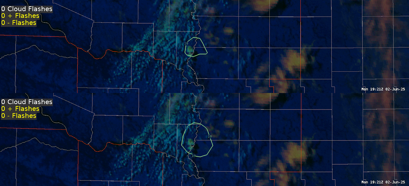
For this first day, I started out looking at Lightning Cast to gain familiarity with version 2 and see how it compares to version 1. The first thing I noticed was in southwest Pueblo County, where there seemed to be fairly frequent lightning. Version 1 in the top left panel (Figure 1 below) actually decreased in probability from 70% to 50%, whereas Version 2 in the top right panel remained at 70%. With both GLM and ENTLN depicting ongoing lightning, I think both versions should be showing higher probabilities. I’m wondering if it’s because both versions are so focused on the convection moving into southeast Pueblo County that they’re less focused on the stratiform lightning/less mature convection?
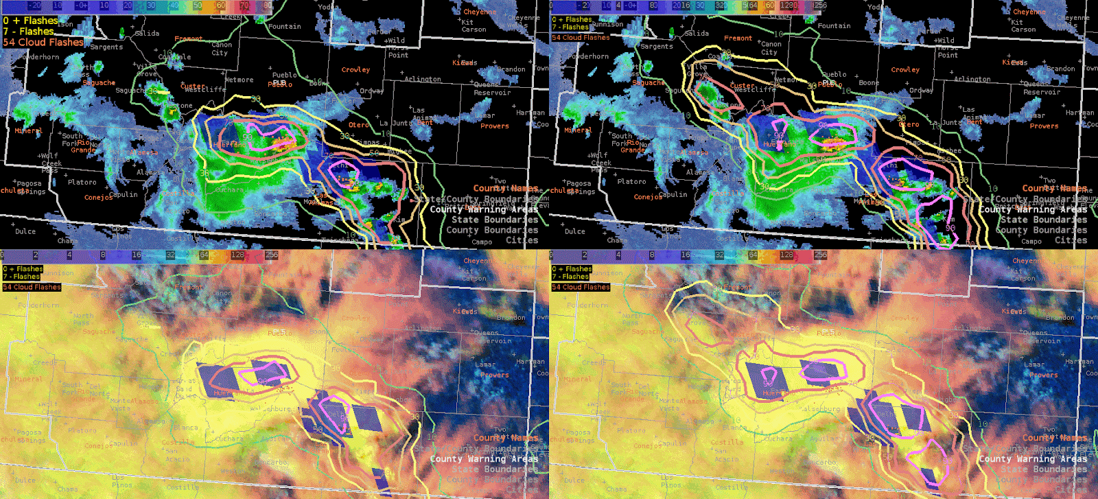
Figure 1: Four panel comparing LightningCast v1 (left panels) and LightningCast v2 (right panels)
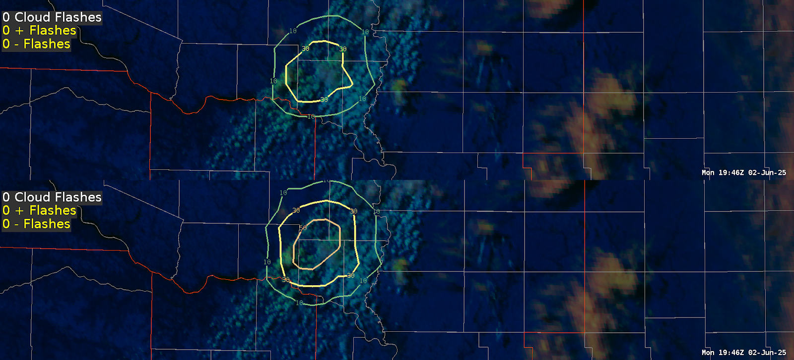
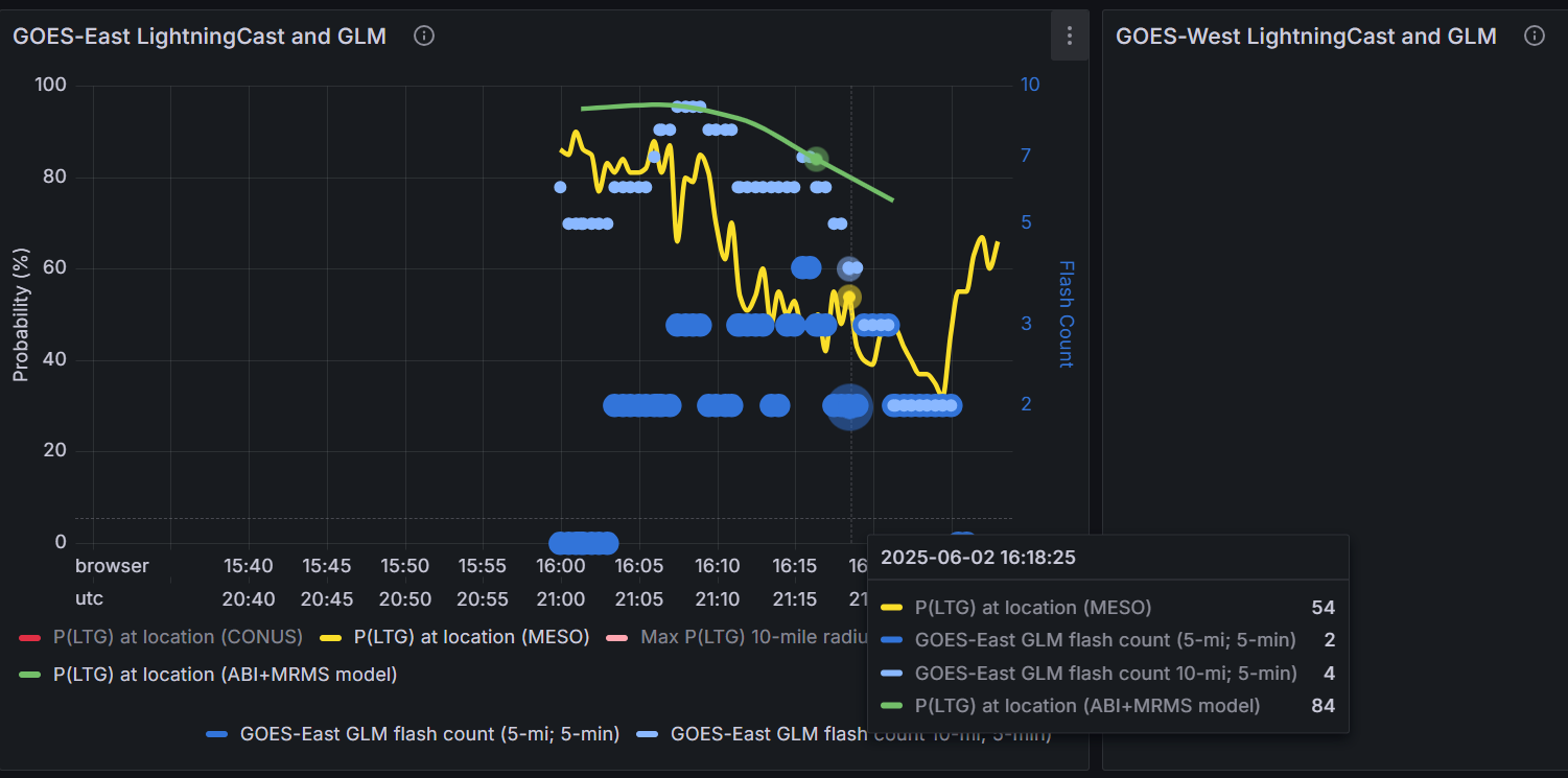
Additionally, I tested out using the LightningCast dashboard for Fowler, CO beginning at 3PM MDT. One interesting thing to note was that it seemed to match better with the version 2 LightningCast in AWIPS versus with version 1, however both versions weren’t too far off. In the Figure 2 below, the left panel (version 1) shows between 30-50% probability of lightning, whereas the right panel (version 2) shows Fowler (purple dot in the image) right on the border of the 70% probability. Comparing that to the dashboard (Figure 3) for the same time, the yellow line (version 1) depicts a 54% probability, with the green line (version 2) showing an 84% probability for 21:18Z. With MRMS reflectivity at the -10C level showing a cell up to 42 dBz just southeast of Fowler, I would tend to lean towards utilizing version 2.
Figure 2: LightningCast v1 (left panel) and LightningCast v2 (right panel)
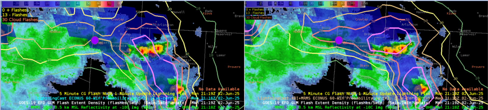
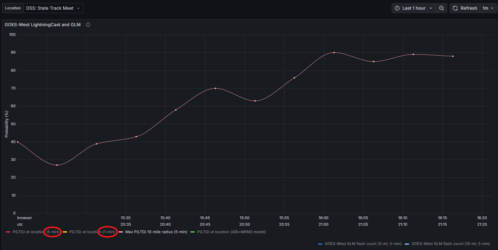
Figure 3: LightningCast Dashboard
One final note on the LightningCast Dashboard - I thought it was interesting to see that version 1 in Figure 4 below, the yellow line (version 1) shows two separate upticks in lightning probability versus the green line (version 2) showing a steady decline in probability.
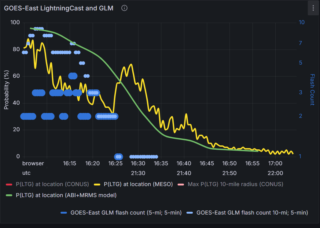
Figure 4: LightningCast Dashboard
GREMLIN
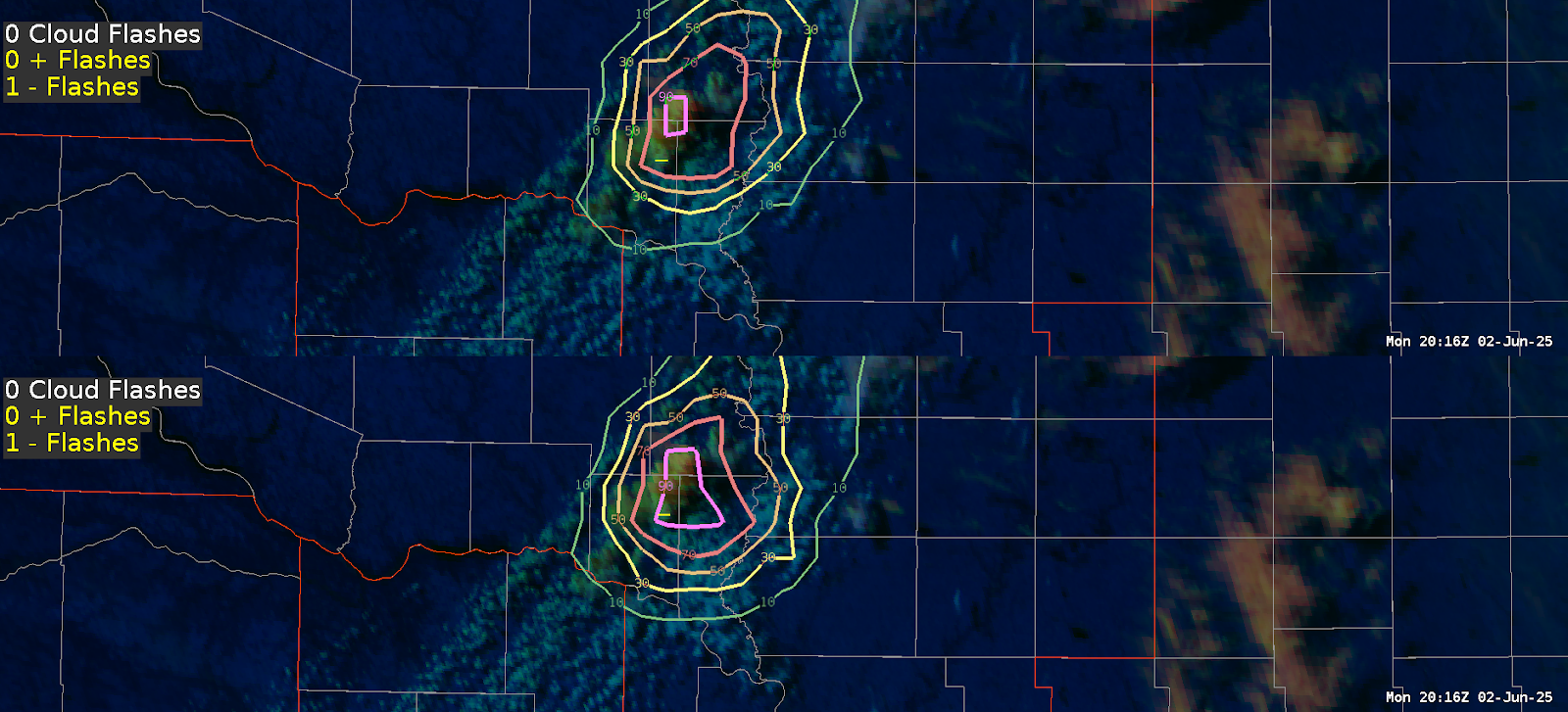
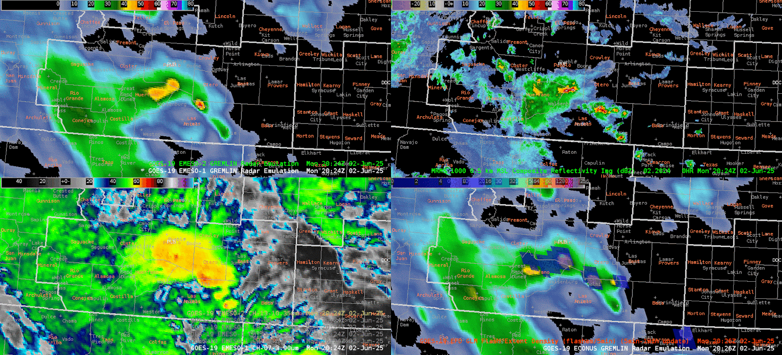
I was also able to look at GREMLIN, which was my first time assessing this product. Figure 5 below shows a four-panel, with GREMLIN (top left), MRMS Reflectivity (top right), Satellite IR sandwich (bottom left), and GLM Flash Extent Density (bottom right). Just looking at MRMS and IR, the first cell that draws my attention is the cell in southeast Pueblo County as it has higher reflectivities and cooler cloud tops. The cell in southern Otero county looks like the cloud tops are slightly warming with time. However once we start looking at GREMLIN, those two cells look to go back and forth in reflectivity, leading to less confidence in overall intensity. If I were located in an area with poor radar coverage, or if a radar was down and I had to rely on GREMLIN, it may not be straightforward as to which cell could eventually warrant a warning.
Figure 5: Four Panel comparing GREMLIN (top left), MRMS Reflectivity (top right), Satellite IR Sandwich (bottom left), and GLM (bottom right).
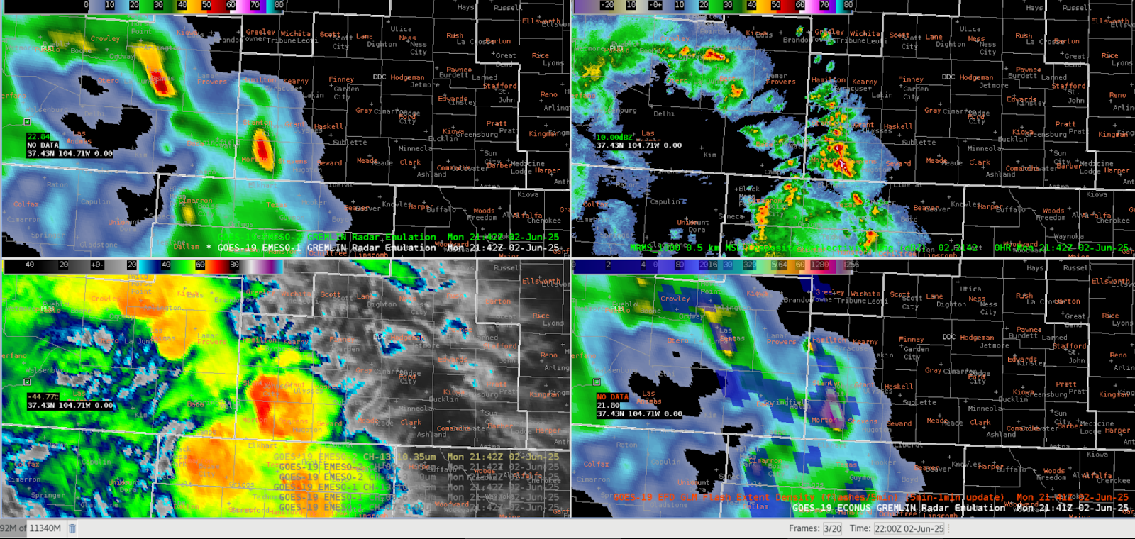
That being said, Figure 6 below shows a screenshot of the same four-panel at 21:41Z, which shows GREMLIN having a pretty good grasp on the convection in Stanton and Morton counties (just outside of the PUB CWA). So in this instance, confidence in the GREMLIN product would at least be higher than the previous example shown.
Figure 6: Four Panel comparing GREMLIN (top left), MRMS Reflectivity (top right), Satellite IR Sandwich (bottom left), and GLM (bottom right).
Final Thoughts for Day 1
Overall I enjoyed testing out both of these products. I definitely want to get more hands-on experience with GREMLIN as well as the LightningCast dashboard in order to see these in different scenarios/environments.
- Fropa